
MELI: A Ruler Is Not a Map
 By
Levi
By
Levi
Lay a ruler across a map of Brazil and it will tell you how far apart two cities are. What it won't tell you is how to get from one to the other. And it has no idea where you're standing.
MercadoLibre (MELI) sold 795 million items across Latin America in the second quarter. We'd guess not a single one traveled the ruler's line. Packages follow roads, and roads bend.
Most of the tools we reach for on a chart work a lot like that ruler. They measure well. They don't orient. It's something we've been turning over for a while now, and MELI's chart this year turned out to be a good place to work through it.
Where MercadoLibre Says It's Headed
MercadoLibre describes itself as the largest e-commerce and fintech ecosystem in Latin America. The marketplace runs in 18 countries, and Mercado Pago, its payments and banking arm, runs in eight.
In its latest shareholder letter, management treats free shipping, the credit card, its own inventory, cross-border trade and the MELI+ membership as parts of one system, each feeding the others. The card gets special attention. Management compares it to the logistics network the company built a decade ago and calls it central to becoming the region's largest digital bank. The letter frames all of this as a transformation that will unfold over decades rather than years, and says investing boldly now is the right response.
One small habit in those filings caught our eye. MercadoLibre reports its growth twice. Revenue rose 50% in the second quarter. On an FX-neutral basis, which holds exchange rates at last year's levels, it rose 43%. Both numbers are true. The company prints both because, in its part of the world, a figure without context can mislead. We'd argue a chart deserves the same courtesy.
The Ruler
We want to be fair to the ruler, because most of us learned on it. Trendlines, moving averages, RSI readings, horizontal support and resistance. These tools do honest work. They keep a trader focused. And they describe what price has already done with real clarity.
Where they come up short, as we see it, comes down to two things.
The first is that they're linear. A trendline takes the last stretch of road and extends it forward, as if the next mile will track exactly as the prior one did. Markets rarely travel that way. They move in waves, and those waves sit inside larger waves.
The second is that they carry no context. An RSI of 30 reads the same whether a decline is just getting started or nearly finished. The number is correct both times. What it can't tell us is where we are.
Not every older method misses this, and it's worth saying so. Dow Theory separated primary trends from secondary ones, and Wyckoff sorted price into phases. Elliott built on Dow's work. The everyday toolkit, the one pre-loaded onto most charting platforms, is what tends to leave context out.
Same Price, Different Place
MELI gave us a clean example this year. The stock keeps coming back to the same neighborhood, roughly $1,600 to $1,800, and each visit has felt a little different.
In March, JPMorgan downgraded the shares and they slipped to a new 52-week low near $1,644. In May, the first-quarter report knocked the stock down 12.7% in a day, and the selling ran all the way to $1,495. By August 18 it was back at $1,779, shortly after the second-quarter report. And now, after reaching $2,066 on September 3, it's trading near $1,713.
Draw a horizontal line through that zone. Guess what? The ruler reads every point the same way. Support is support. But notice how price got there each time. In March and May, it arrived making new lows. Since then, it has come in from above, after bounces off the May low. The price matched. The place didn't.
The ruler wasn't only on the chart, either. Profits declined three quarters in a row, and along the way Wall Street's average price target came down from $2,815 to $2,257. Management had already put a number on the dip, estimating that its growth investments cost about 5 to 6 points of operating margin in the fourth quarter of 2025. The crowd saw a falling line and extended it. That's a very human thing to do. We catch ourselves doing it too.
So if a ruler can't tell these visits apart, what can?
Reading the Map
Enter the methodology that tracks human behavioral patterns. These patterns are fluid and dynamic rather than linear in nature. This way of viewing the markets takes the entire map into account and provides context for what is likely ahead. Let’s have a look at the chart shared by Zac Mannes with his most recent Wave Setup for MELI.
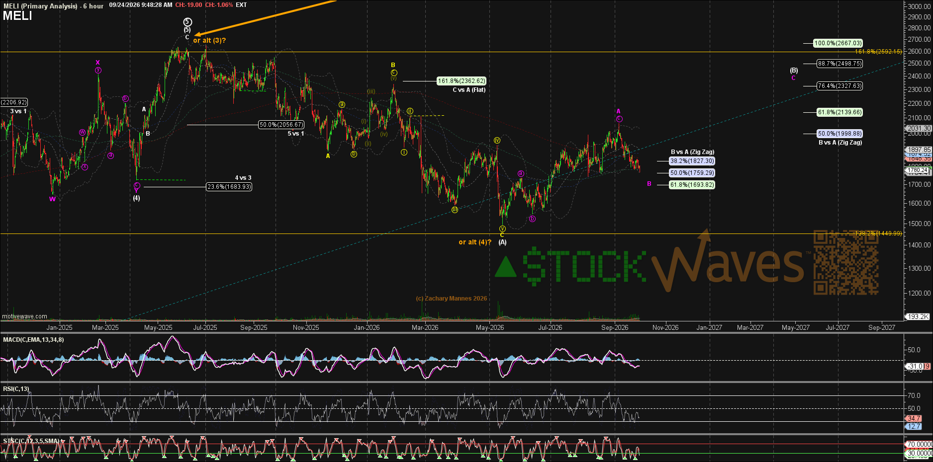
The primary path, in magenta, suggests price is near the wave B low and should soon begin wave C of the larger wave (B).
Zac is showing the orange wave (4) low as an alternate count. How would we differentiate paths? The next rally would look the same on either path. The pullback from the next high is what tells them apart. For now, we will follow the primary scenario shown.
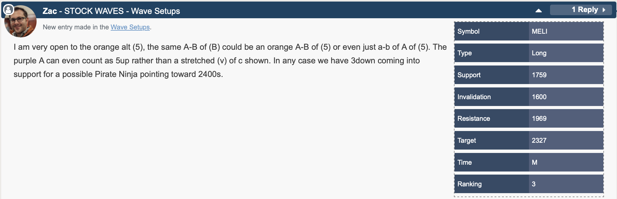
We have clear parameters as well as a specific target overhead. If the setup invalidates, the bullish case isn't necessarily over; we'd revise based on the structure price builds from there. Defining risk against reward keeps us accountable and gives traders a way to manage the position.
Conclusion
A ruler measures. A map orients. We keep both in the toolbox. But only one of them tells us where we're standing. It's a lesson we seem to relearn every once in a while.
MercadoLibre doesn't ship along the ruler's line. It ships along the road, bends and all. Price travels much the same way. For now, the road on MELI's map bends higher.
