How to Use "Where Fundamentals Meet Technicals" Pieces
 By
Lyn Alden
By
Lyn Alden
In addition to my twice-monthly deep dive fundamental reports, each week I also publish a piece that covers a few stocks where the fundamentals and technicals both suggest a similar outcome, either bullish or bearish.
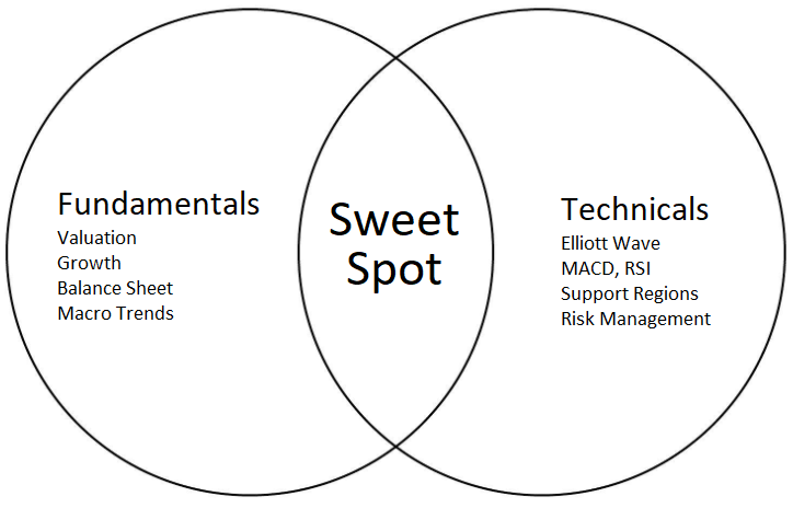
Fundamentals include things like growth metrics, balance sheet strength, macro factors affecting the business, and valuation. Technicals include Elliott Wave charts, relative strength, MACD, support/resistance zones, and so forth, and I reference Zac and Garrett’s work for that portion.
Sometimes I initiate coverage on stocks in these pieces, and other times I provide fundamental and technical updates on stocks that I have existing coverage for.
There are a few ways that investors can choose to use these “Where Fundamentals Meet Technicals” pieces. While this is not investment advice, it’s an overview of some ways that investors could choose to incorporate the information into their investment approach.
The short version is that both fundamentals and technicals are just probability assessments of future stock outcomes, and including both together helps to increase the percentage of hits.
Long-Term Investors
As a long-term investor or “position trader”, I often buy things with an intention to hold for 3-5 years. This is a tax-efficient way to compound capital, since it is very scalable.
To do this, I buy shares of a business whose revenues, cash flows, dividends (if any), and balance sheet strength are likely to improve in the years ahead, while the valuation should act as a tailwind as well. The value of my shares increase over time, and the company may also spin off regular cash dividends as well, which I can reinvest into more shares or spend them.
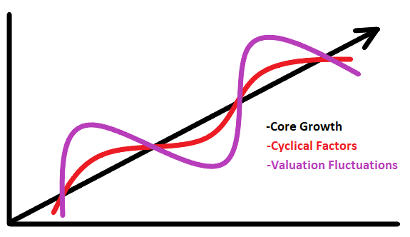
Let’s take a typical growth stock as an example. In the chart below, the black line represents their core structural growth. The red wave represents what their actual business results might be over time, as cyclical factors affect the specifics of their business, with various tailwinds or headwinds during a given year. The purple wave represents what the stock price of that business might be, as investors tend to enthusiastically overprice it when things are going particularly well, and tend to underprice it when things get a little tough.
Long-term investors can choose to just buy and hold and dollar-cost average into it, and let the structural story play out. I think that’s a good approach for many people.
However, if we want to risk-manage that a bit and improve our timing, ideally we would buy in when technical sentiment is weaker but turning up, when the valuation is on the lower side of its average, and so forth. Similarly, we could trim our position or sell covered calls against it, whenever the valuation and technical sentiment both become a bit excessive.
Especially when it comes to starting new positions in stocks I’m bullish on, I’d prefer not to buy into a clear downtrend. I’d like to see it starting to turn up, starting to show evidence of a local bottom with positive technicals, while the long-term fundamentals are in its favor.
Swing Traders
The reports are also useful for swing traders, who have a time frame of weeks and months. All else being equal, it’s better to bet on an undervalued stock reverting to its historical average valuation, than an overvalued stock getting even more overvalued, for example.
So when technicals show evidence of an oversold bottom with momentum indicators turning up, while at the same time the stock is pretty cheap and has a good long-term outlook, that’s often a good buying point. The signs to exit would be that the stock is getting quite expensive again, that technical signals are showing signs of being overbought and ready for a correction.
Risk Management
Sometimes technical charts look positive, but the stock is already very overvalued or has a weak balance sheet. It can be useful to know these things before investing, since it could reduce the probability of success.
Similarly, sometimes the fundamentals look positive, but the collective wisdom of the market is starting to sniff out a problem before analysts figure it out. If the price isn’t confirming a positive fundamental thesis, it helps to know. It could be that the market is slow to figure it out, or it could be that it knows something that analysts don’t know yet.
In that sense, fundamentals and technicals both support each other, and reduce risk. If the fundamentals and technicals of a stock both look constructive, then the probability of that stock being a terrible investment are probably pretty low. On the other hand, if a stock is both fundamentally overvalued and the technicals also paint a negative picture, that might make for a good short position.
Tools of the Trade
Fundamental investors have a variety of tools to analyze a company. Like any project, there are different tools for different situations. In other words, the appropriate metrics to analyze a bank or healthcare company could be very different than the appropriate metrics for a software company.
In addition to reading SEC filings and looking at investor presentations, my favorite toolbags are F.A.S.T. Graphs and YCharts. These provide good visual information on fundamentals, with many different metrics to use within them, which makes them particularly well-suited for sharing an investment thesis with an audience.
Amazon Example
If we look at the F.A.S.T. Graph for Amazon (AMZN) for example, we can see that the stock price has tightly hugged an average of 25x operating cash flow for nearly two decades. In this chart, the black line is stock price, the blue line is what the stock price would be at its average operating cash flow multiple (which happens to be 25.12), and the orange line is what the stock price would be if the stock traded at an operating cash flow multiple equal to its average annual growth rate (which happens to be 30.42).
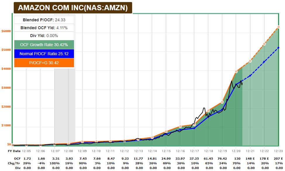
We can see that when the stock became more expensive than usual, it generally entered a period of correction or consolidation until fundmanetals caught back up. As Amazon matures and slows down, we should expect the valuation multiple to gradually decrease, but so far this has been a very strong relationship.
If we pull out YCharts, we can look at other metrics like the changing profit margin and return on invested capital over time. In Amazon’s case, they have both been heading higher:
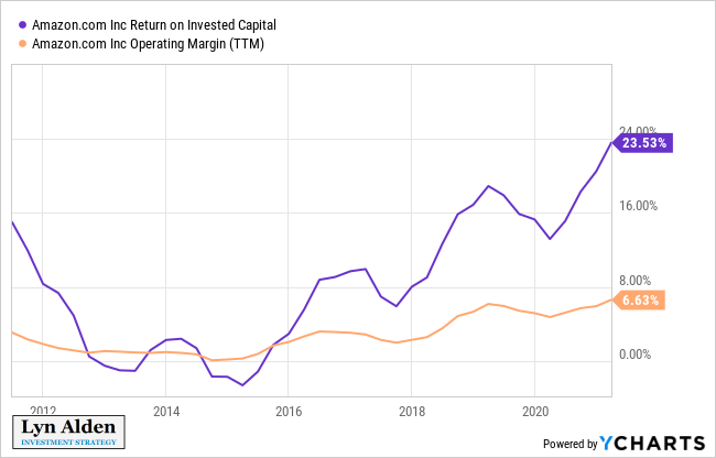
This upward trend is due to Amazon’s cloud business. Online retail was never a particularly profitable business, but as Amazon Web Services hit critical mass, that has become a key profit driver for the company.
Enterprise Products Partners LP Example
For a second example, let’s look at a value stock: a master limited partnership called Enterprise Products Partners LP (EPD) that transports oil, gas, natural gas liquids, and petrochemicals.
Understanding fundamentally what it does is helpful for a long-term investment thesis. It transports products, and thus is not too tied to their price fluctuations but is tied to their volumes in the US. Additionally, crude oil represents a pretty small piece of what it does: natural gas, natural gas liquids (especially), and petrochemicals together represent the vast majority of their business, and these lines of business are more “future proof” against things like electric vehicles.
The F.A.S.T. Graph shows that it has typically traded at around 21x earnings (blue line). For a stock with a high yield and slow growth rate, F.A.S.T. Graphs also shows an orange line with a default 15x earnings multiple. The white lines represent the annual dividends/distributions over time, and we can see that they never had to cut dividends/distributions during a recession or energy price crash.
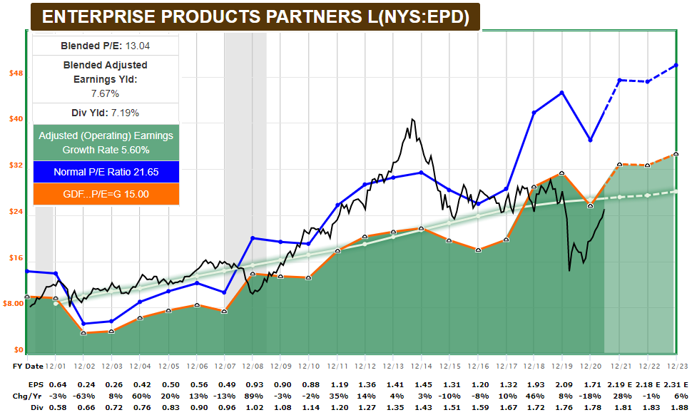
As the chart shows, the stock become unusually cheap in 2009 and 2020, and unusually expensive in 2014.
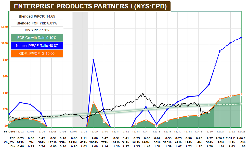
We can also look at free cash flow for the business, and see that in recent years, they shifted from external financing to self-financing. In other words, they started growing more slowly but also more sustainably, generating free cash flow and not relying on issuing equity for capex like they used to.
If we pull out YCharts and compare EPD to another large energy transportation company, Energy Transfer LP (ET), we can see how conservative EPD is with its leverage. It has about 4x debt/EBITDA (which is quite reasonable for this industry), whereas ET is more leveraged at 8x debt/EBITDA.
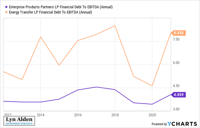
That doesn’t mean EPD will necessarily outperform ET. In fact, during bull markets, a more leveraged entity like ET could very well outperform. However, it tells us something about risk which is why it’s important to be aware of. ET had to cut its dividend/distribution in 2020, for example, in order to protect its balance sheet. EPD has a much better credit rating (BBB+ vs BBB-) and more financial “space” to work with during difficult environments, which all else equal leads to a safer dividend/distribution.
Although not without risk, EPD is closer to a “set and forget” type of investment while ET has to be watched more closely.
Summary
Understanding the fundamentals of an investment can benefit long-term investors and intermediate-term traders. It’s generally best to find situations where the fundamentals and technicals are both on your side.
Valuations and balance sheets don’t tell us much about near-term price action, but keeping them in mind helps reduce tail risks. Meanwhile, even analyzing all of the fundamentals can’t tell us for sure what will happen, which is why looking at technicals and price confirmation helps us know if an investment is working out as expected, along with various support levels to watch out for.
