Deep Dive: Macro Update and Markel Analysis
 By
Lyn Alden
By
Lyn Alden
This report focuses on macro updates, discusses the latest portfolio updates, and then analyzes a relatively cheap insurance company with a historically great rate of return that has some advantages over traditional insurers.
As a housekeeping note, I recently published a public article on Bitcoin. As others have described it, it’s basically the case for considering a non-zero position in Bitcoin at this juncture.
I initially suggested Bitcoin as a bullish opportunity for a small position in my April 12th deep dive report, a couple weeks after it had a sharp drop in March and the beginnings of a recovery. Although we’ve since had quick 30% gains on that position, I still think that trade most likely has a long way to go. So, I decided to create a longer and more detailed public write-up for why I think the asset has a good risk/reward opportunity as a small position over the next 2 years.
The article made its way around cryptocurrency media as well (they understandably love it when a non-crypto investor likes crypto).
From newsBTC:
Lyn Alden, the founder of Lyn Alden Investment Strategy, recently shared three reasons why she is macro bullish on the cryptocurrency in an extensive blog post. The reasons the prominent financial analyst and commentator shared are as follows: Bitcoin has extremely strong network effects, BTC’s block reward halvings lend to price appreciation, and the crypto market has an “ideal” macro backdrop.
From Cointelegraph:
Strategist Lyn Alden said she switched from “uninterested to quite bullish on Bitcoin” in 2020. Following the drop of BTC to sub-$3,600 in March, she remains optimistic on the top cryptocurrency.
Notably, it has been interesting to watch gold enthusiasts, Bitcoin enthusiasts, and altcoin enthusiasts argue with each other in the Twitter comment section about the article, to some extent angrily. It tends to be an asset class that generates very strong emotions among investors.
So, check that out if you’re interested in an article about Bitcoin written for generalist investors. Even for folks that choose not to invest in it, the article can help people understand how it works and why other folks like it.
U.S. Business Cycle Update
We’re at a two-stage inflection point for the unemployment situation.
Inflection Point 1) The initial round of small business “PPP” loans matured at the end of June, meaning that companies can meet the criteria to turn those loans into grants, and start laying off employees they don’t need anymore. Prior to that point, they had to keep most of their employees on payrolls, even if it’s not economically sensible to do so, in order to meet the criteria to turn the loans into grants. The non-seasonally-adjusted jobless claims data may already be showing the results of this, but it’s too early to say.
Inflection Point 2) At the end of July, the $600/week in extra unemployment benefits provided by the federal government expire, meaning that the 17+ million people currently receiving unemployment benefits will suddenly receive a lot less money, which has economic ramifications for the landlords and businesses that they spend money on, and basically has ramifications for overall system solvency. I think it also affects the 12+ million people on the Pandemic Unemployment Assistance program as well.
One of the issues with the $600/week in extra unemployment benefits that could prevent it from being extended in its current form, is that recipients of it that are otherwise on the lower end of the income spectrum receive more money by being on that program than from getting back to work if a job is available. It’s justifiable as a 4-month program during a pandemic, but more complicated to extend it without some alterations.
Many investor eyes, therefore, are fixed on what the next round of fiscal stimulus will be, and when it will pass. Both political parties in the United States are indicating another fiscal round in the months prior to the November election, but they have differences regarding what that stimulus should look like.
In the meantime, there is a clock ticking that, if unaddressed, could remove a key pillar for why the stock market has been able to levitate compared to the broader economy: massive fiscal injections to offset the economic damage, that were monetized by the central bank, or what Bridgewater’s Ray Dalio would refer to as “monetary policy 3”.
Given the civil unrest we saw last month, it will be interesting to see how tens of millions of unemployed people deal with a sharply reduced income if it is not extended in some form. I don’t think either political party wants the press for that shortly before the election, but I’m not a political strategist so we’ll see.
COVID-19 Updates
For the past few premium reports, I’ve been noting an uptick in COVID-19 cases in the United States, but not yet in terms of deaths. However, in the report from two weeks ago, I noted:
However, deaths happen with a lag after reported cases, so by perhaps mid/late July, we’ll know if this surge in cases in June leads to an increase in the number of deaths or not.
-Lyn Alden, July 5
Well, it’s mid-July now, and we’re indeed getting an uptick in deaths.
Here’s the USA as a whole:
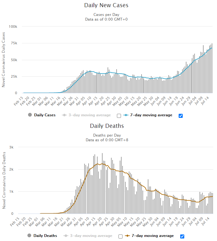
Chart Source: Worldometer
However, most of the increase is happening in places like California, Arizona, Texas, and Florida, whereas the northern states were hit harder back in March and April. Here are the numbers specifically for Florida:
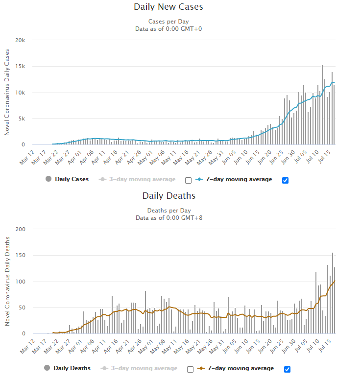
Chart Source: Worldometer
The charts for Arizona, Texas, and California all look pretty similar to Florida, with a notable rise in cases and deaths.
There are many potential confounding factors, like changing testing rates, and what sorts of deaths are classified as coronavirus deaths, and so forth. However, the increased pressure on hospital systems in these hard-hit states, and the rate of change of deaths, are notable and pretty clear.
The fatality rate in percentage terms is still quite low, probably because the most vulnerable groups are more protected now compared to March, while exposure to the virus has spread more among less-vulnerable groups. In terms of absolute deaths in the United States, however, this is about the equivalent of a 9/11 event happening twice per week at current rates.
Some other countries have similar increases in cases and deaths, while others don’t. The United States is unique among developed countries at this juncture in terms of magnitude per capita; places like Europe and Japan have much smaller percentages of new deaths and new cases relative to their population levels.
At the moment, more people are dying per day with the virus identified as the cause in Florida than the entirety of continental Europe, for example. And although Japan has a 4x higher population than Texas, orders of magnitude more people in Texas are dying from the virus per day than in Japan. California and the United Kingdom currently have about the same weekly death rate, although the United Kingdom has 70% more people.
Many places like the European Union and Canada that have the virus relatively under control at this time, have blocked Americans from going into their countries, and have extended the time-frames of those blockages. We’re unfortunately one of the “hot spots” at this time:
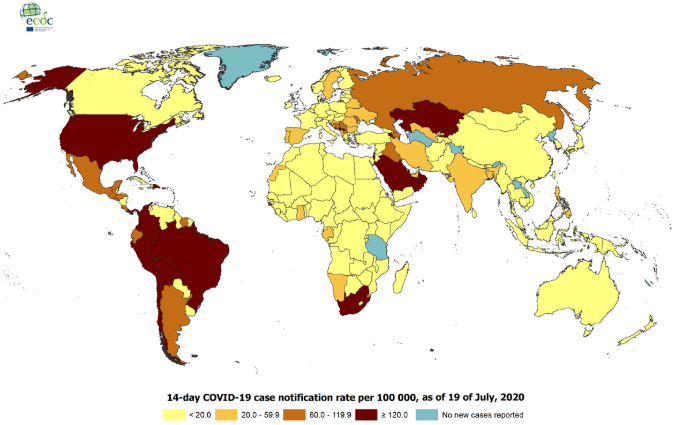
Chart Source: European Centre for Disease Prevention and Control
Some countries on that map don’t have very trustworthy data, particularly many developing countries, but Europe and developed east-Asia have very extensive testing environments.
Unemployment Situation
Last week, initial jobless claims came in at 1.3 million, which continued the trend of slightly lower numbers each week. Continued claims also ticked down to 17.3 million.
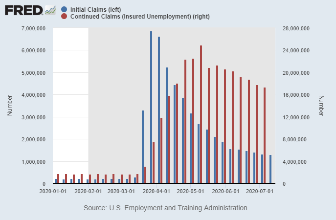
Chart Source: St. Louis Fed
It’s worth noting that weekly initial claims are still 2x higher than the peak level that was reached in the 2008/2009 financial crisis. There’s an amazing amount of job churn out there, with seven figures in jobs being lost and created each week, according to the data. And if we include self-employed people that are receiving aid under the Pandemic Unemployment Assistance program, the total number of Americans receiving some sort of unemployment assistance is over 32 million, which is remarkably high.
Digging into the report, it showed that if we look at non-seasonally-adjusted numbers, this was the first uptick in initial claims (top) and continued claims (bottom) in months, which isn’t good:
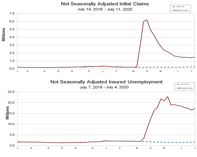
Chart Source: U.S. Department of Labor
I suspect this has to do with some of those PPP loans maturing, meaning that small businesses can let employees go without affecting their loan forgiveness. It likely also has to do with paused re-openings and/or renewed lockdowns in some southern and western U.S. states as the virus put some pressure on their hospital systems.
It’ll be interesting to see the next two weeks of jobless claims data; one week does not make a trend.
Dollar Liquidity Updates
Longtime readers know that I’ve followed the offshore USD shortages and onshore USD shortages for quite some time now.
After a rapid rise for months, there were four weeks in a row, from mid-June to mid-July, where the Federal Reserve’s balance sheet was consistently decreasing. However, as of last week, they broke that trend with an increase; the Federal Reserve resumed an uptrend in balance sheet growth.
There has been remarkable correlation between the Fed’s balance sheet and the U.S. stock market; the Fed’s balance sheet level peaked the same week that the equity market consolidation began, in mid-June:
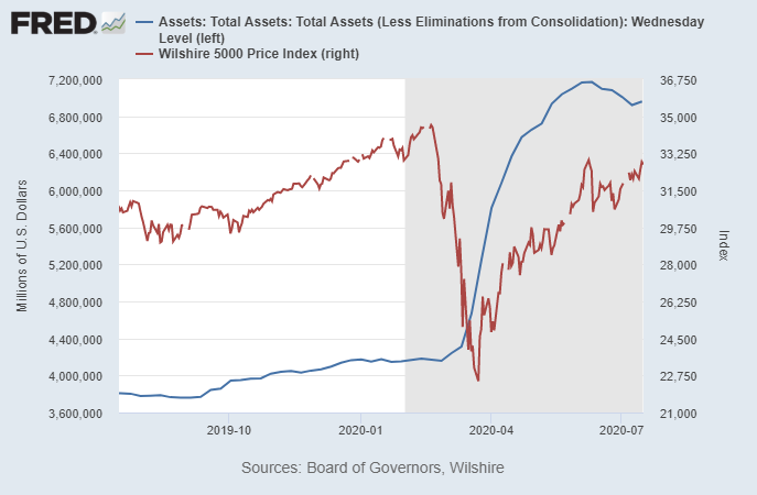
Chart Source: St. Louis Fed
For folks that dig into the numbers, the reason for the Fed’s balance sheet decrease over the past four weeks was clear. Although the Fed continued to buy assets, and hit new all-time highs for Treasury security holdings each and every week, they began winding down their short-term loan operations. Or more specifically, demand for their loans subsided; the Fed still has those lines open, but demand for them diminished.
Since the repo rate spike in September 2019, the Fed has had an open line for repurchase agreements. Two weeks ago, that went down to zero for the first time since September 2019. And the Fed’s liquidity swaps with foreign central banks, which peaked in May, have been substantially reduced by about 2/3rds as well. Here’s a chart of repo loans (red line) and central bank liquidity swaps (blue line); the combined portion of the Fed’s balance sheet that has notably gone down over the past month. That’s good news:
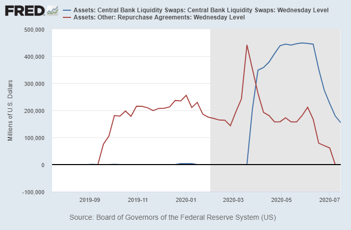
Chart Source: St. Louis Fed
The Treasury/Eurodollar spread remains low, indicating that offshore USD shortage in major countries is not acute at the moment. It could come back later this year or next year, though, so it’s something I continue to monitor as the world’s solvency issues play out.
For anyone who is unfamiliar with what I mean by global dollar shortage, I’m referring to the trillions of dollars of USD-denominated debt that exists outside of the United States. Many companies, and in some cases governments, rely on dollars from trade to service those debts. Early this year, as China initially shut down from the virus and as commodity prices fell, global trade diminished and U.S. trade deficits decreased, with means fewer dollars go out into the world to keep those USD debts supported. However, as of the numbers for May (which were released in early July), the U.S. trade deficit is back to pretty deep levels, meaning plenty of dollars are getting out into the world.
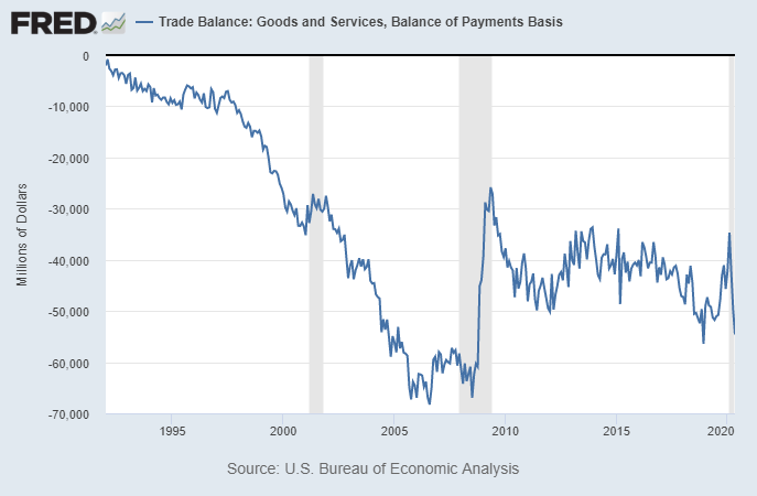
Chart Source: St. Louis Fed
For now, with the offshore dollar shortage in major countries at bay, and plenty of liquidity around, the dollar has been weakening since March. Bloomberg had a great chart the other day showing that the DB USD trade weighted index is down to testing its decade-long support line:
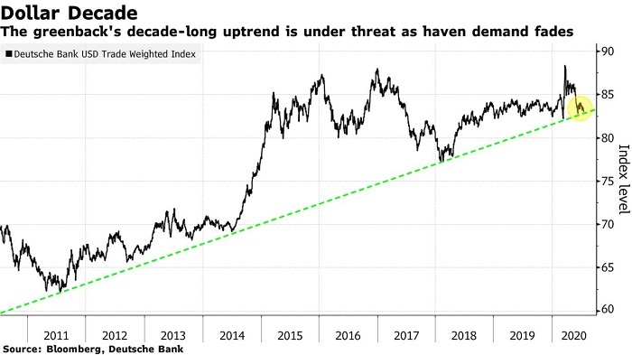
Chart Source: Bloomberg
I don’t know if it’ll bounce up from here, or break through that historical support. I think a lot of it could depend on what happens with the next round of U.S. fiscal stimulus, in terms of magnitude and timing. It also depends on the virus and peoples’ economic behavior in response to the virus. Worldwide reductions in economic activity and trade tend to favor an upward dollar squeeze, but if the U.S. has looser fiscal and monetary policy than the rest of the world and a higher unemployment situation, it can lead to a weaker dollar.
I’m dollar bearish with a longer-term outlook (structurally, since early October 2019), but the next 6 months depends on too many variables to predict. In addition to monitoring signs of liquidity problems (which look pretty good at the moment), price action can give us some clues.
In addition to that trend line above, for example, there are a few levels to watch on the DXY dollar index as well:
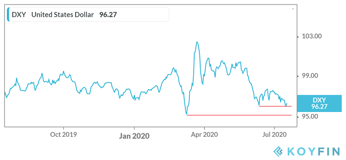
Right now it’s bouncing for a potential double-bottom around 96. If it breaks down firmly below that, which would also be a breakdown below the diagonal DB support level reported by Bloomberg, the downside potential gets quite interesting.
However, the March bottom around 95 is another backup support level. Unless or until the dollar breaks firmly below that, market participants can reasonably argue that it’s just in a wide trading range.
So, at the moment I’m just watching. I’m not much of a chartist, but these are the levels I’m paying attention to, given my interest in dollar strength/weakness and its importance for a variety of asset classes and underlying global economic growth rates (due to the dollar’s effects on global liquidity).
Latest Portfolio Changes
We’re at a pretty critical juncture for the market. The S&P 500 is testing the mid-June high, and has a golden cross in place (50-day moving average crossed above the 200-day moving average), the daily RSI isn’t overbought, and MACD looks okay.
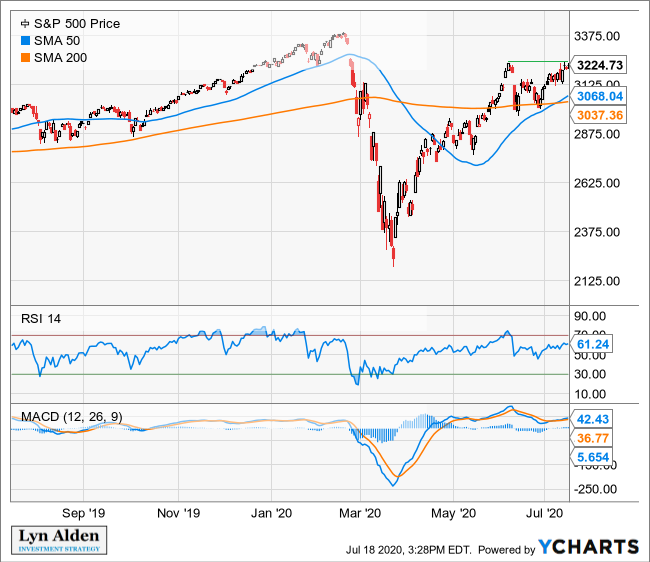
However, the put/call ratio is still near historic lows, suggesting a lot of investor bullishness and complacency in the options market. Historically that’s a pretty good contrarian signal.
I haven’t made very many changes to the portfolios lately.
I did short Tesla a couple times, and put those trades in the Google drive and members area in real time. The first short attempt was on July 8, and for a while that was working, but a big speculative options purchase pushed the price up above my exit price, so I covered for a small loss and just kept watching. And then it had what may have been a blow-off top about a week later, where the stock quickly went over $1700 intra-day and then fell down hard. So, I shorted again over $1500.
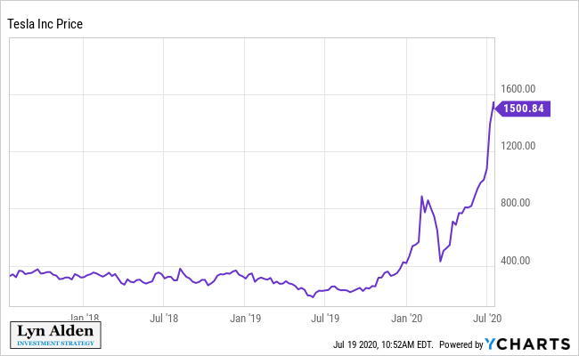
I don’t recommend shorting stocks for most people, and only occasionally do it myself. I made some positive returns shorting Tesla’s February spike, although I covered a bit too early on that one. I’ve been stalking another short opportunity here; when Tesla’s chart goes absolutely vertical and reaches extreme sentiment with historically low short interest, it can have sharp turnarounds.
The bullish possibility is that Tesla might get added to the S&P 500, which would cause an inflow of passive funds into it and potentially push it up even further. To my knowledge, it’s the largest company in U.S. history in terms of market capitalization to not be in the S&P 500. The reason for this is that Tesla has not yet met profitability requirements of being in the S&P 500.
A few people asked me how I shorted the stock. I simply used an actual short position, not an options trade. When I say I am short a stock, it means I am short the stock. If I use options to express bearishness on a stock (which I don’t normally do), I’ll indicate that.
It’s important to use defined exit points when shorting, because if the stock moves against you, it can really run away to the upside.
Top Twelve Change
I removed Tractor Supply Co (TSCO) and added Markel Corporation (MKL) to the Top Twelve list in the Google drive today. Markel’s reasons are outlined in the second half of this report, which focuses on that company.
Tractor Supply stock was a recent victim of its own success. I added it to the Top Twelve list back on March 1, 2020, and in less than five months, it soared by almost 60%:
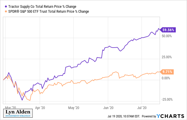
That’s certainly better than my base case expected to happen. The company is doing quite well but the valuation is now a bit stretched. It’s not extremely expensive, so I’m not selling any of my shares, but at this price point it’s no longer a good fit for the Top Twelve list.
ETF Spotlight: Invesco S&P 500 Equal Weight ETF (RSP)
There has been another value/growth rotation.
As I described on a number of occasions including my June newsletter, I’ve been tracking the ratio of the S&P 500 equal weight index over the S&P 500 market weight index during this recession, as shown here, with close-up and long-term views:
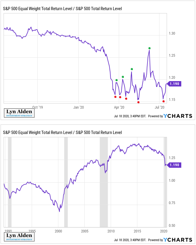
Whenever the ratio goes higher, it means there is more market breadth, and basically that the mega-caps are underperforming the broader index. Whenever the ratio goes lower, it means there is more market concentration; the mega-caps are outperforming the broader index and reaching higher levels of concentration.
Over the long-run, based on Wilshire data from the late 1970’s and S&P data from the late 1980’s, large cap equal weight indices have outperformed large cap market weight indices, because they rebalance themselves with a value tilt. However, the equal weight tends to outperform early in a business cycle, and market weight tends to outperform late in a business cycle. The conclusion of each business cycle tends to have a sharp move down followed by a sharp move up in the ratio, as market leadership changes.
Rebalancing for the equal weight version skews this over the long-term; despite equal weight outperformance, the market hasn’t been this concentrated into the top 5 stocks in over 40 years, with the top 5 stocks currently accounting for a full 25% of the 500-company index. Most of this concentration occurred in the past 5 years; the period where equal weight indices consistently underperformed despite rebalancing, as the mega-caps kept outperforming the broader index.
After the COVID-19 crash, in March, April, and May, the ratio kept making lower lows and higher highs in a megaphone pattern. It had lots of volatility for a potential rotation shift, but no clear direction. The ratio hit a peak in June, on the same day the S&P 500 topped, and then had a sharp decline as the market consolidated into July. However, this recent July bottom in the ratio didn’t quite hit as low as it did in May; this is a slightly higher low, followed by apparently another bounce. That’s interesting, because it’s the first higher low for the ratio in this recession.
Unless this time is different (and that’s always a possibility to consider), it will be tough to have a new market cycle and bull market without the equal weight S&P 500 eventually leading the way over the market weight S&P 500. In other words, that would entail a growth-to-value rotation, with beaten-down banks, industrials, energy, and material stocks outperforming high-value tech, communications, and consumer discretionary stocks.
If, on the other hand, we continue to have unhealthy breadth in the markets and continued concentration into the top 5 companies, market weight would outperform. Watching the ratio for lower lows vs continued consolidation and breakout, is key here in my opinion.
I personally like the equal weight S&P 500 at this point (ETF ticker: RSP) as part of a diversified portfolio.
Markel Corporation (MKL) Deep-Dive Analysis
Markel Corporation (MKL) is a specialty insurer. They are often described as a “mini-Berkshire” because in addition to running insurance operations, they own equities in their portfolio and invest in controlling stakes of whole businesses, similar to Berkshire Hathaway, and have enjoyed considerable outperformance over the market for decades with long management tenures.
Property and casualty insurance is generally a commodity-like business, without a ton of differentiation or pricing power between insurers. Markel, however, focuses on specialty insurance lines, meaning types of insurance that are less common, requiring more niche expertise, and come with higher margins if performed well.
Their insurance specialties are numerous, ranging from career-related insurance for professionals, equine-related insurance, classic cars, fine art, marine, and so forth. They also have a smaller reinsurance business.
Their portfolio emphasizes blue-chip dividend payers, with exposure to some of the mega-cap growers as well. For a couple decades now, their book value has grown faster than Berkshire Hathway’s book value, although they have the advantage of starting from a smaller base. Markel’s book value is just under $10 billion, compared to over $370 billion for Berkshire. Notably, by far Markel’s biggest equity holding in their portfolio is Berkshire Hathaway stock.
Their Markel Ventures division was started in 2005, and invests in businesses that they control the majority of. Those businesses are pretty broad:
Our Markel Ventures products group is comprised of businesses that manufacture or produce equipment, transportation-related products, and consumer and building products. For example, types of products offered by businesses in this group include equipment used in baking systems and food processing, over-the-road car haulers and laminated oak and composite wood flooring used in the trucking industry as well as ornamental plants and residential homes.
Our Markel Ventures services group is comprised of businesses that provide healthcare, consulting and others types of services to businesses and consumers. For example, types of services offered by businesses in this group include management and technology consulting, behavioral healthcare and retail intelligence.
-Markel 2019 Annual Report
Management and Performance
The company was founded in 1930, but didn’t become public until 1986. They have greatly outperformed the market over the past three decades, although they had the benefit of starting as a smallish company.
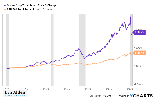
Like many stocks that fall into the “value” camp, Markel has underperformed the S&P 500 by a significant margin in the past five years. The company itself, however, did very well during that period. Here are their pre-recession results:
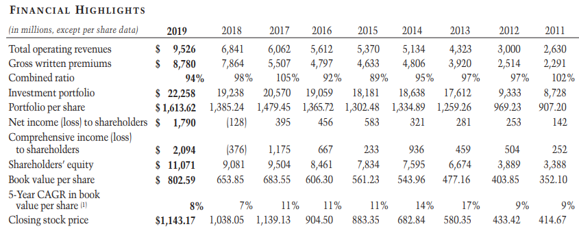
Table Source: 2019 Markel Annual Report
The first quarter of 2020 was rough. In addition to a $1.7 billion portfolio loss due to reduced equity prices, the company took a $325 million underwriting loss from claims related to COVID-19. The good news is that in Q2, their equity portfolio likely had a strong rebound, erasing much of those Q1 losses. The big question is how their underwriting business did.
In addition to losses directly attributable to the pandemic, one of the big problems at the moment with insurance companies, and the broader financial sector in general, is that interest rates are so low. Banks make a large portion of their money on their interest rate spread, and insurance companies make a lot of money on giant bond portfolios. If interest rates are at rock-bottom levels, those returns are threatened.
The advantage of Markel compared to other insurers, is that they also invest in equities and wholly-owned businesses, so they have more inflation protection and a bit less interest rate exposure.
Markel has rather decentralized leadership at the moment rather than one big figure. Alan Kirshner was the company’s CEO from when the company went public until 2015, and was with the company since the 1960’s. He was Chairman of the board until this year, 2020, when he stepped down.
The company is currently led by co-CEOs Richard Whitt and Thomas Gayner, both of whom have fairly long tenures at the company. Gayner also gets attention as the company’s chief investment officer, which is a key role for a company that is heavily reliant on good portfolio management. The chairman of the board is Steven Markel, who used to be the vice chairman until he replaced Kirshner, and he has been on the board of directors since the 1970’s. So, there is tenured leadership here, which is good to see when a company has a history of doing well.
Valuation Analysis
Markel’s earnings tend to fluctuate substantially based on market performance of their portfolio due to accounting for changes in equity prices, which are inherently volatile. So, a F.A.S.T. Graph is not a very useful valuation method for the company.
For insurance companies, taking note of price-to-book value tends to be the key valuation metric. I don’t particularly like book value for most sectors, but it’s arguably the most important valuation metric for insurers.
Looking back over the past three decades, Markel is trading at a historically low price-to-book multiple:
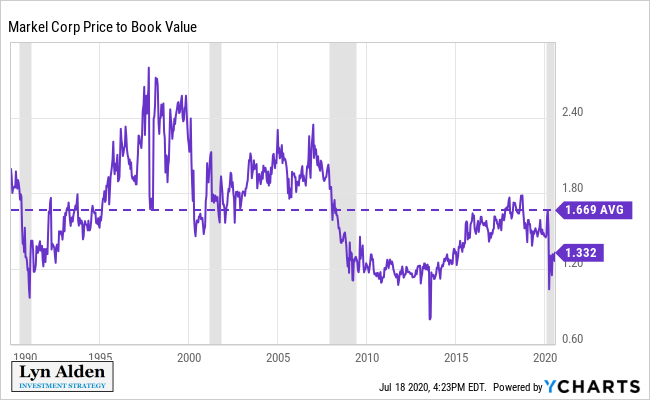
This is favorable, especially considering that the broad S&P 500 is, by many metrics, among the most expensive it has ever been.
That chart actually understates how cheap Markel is. The stock price is updated daily, but the book value can only be updated quarterly, from quarterly reports. The equity market bottom was on March 23, right at the end of the first quarter of 2020. Markel lost 12% of their book value in Q1. During Q2, there was a big equity rebound, and Markel’s book value most likely went sharply up. We’ll find out in a couple weeks.
So, the below-average 1.3x price-to-book value is based on dividing the most recent stock price by the Q1 book value. If we get a rebound in book value in Q2 and Markel’s price stays roughly where it is now, that could put the book value closer to 1.2x, which is near the bottom of its three-decade historical range.
Over the long run, Markel’s stock keeps pace with book value growth, and overshoots it to varying degrees based on investor sentiment. The gap tends to widen near the end of business cycles, and shrink during recessions and the early parts of business cycles:
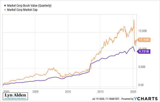
The company historically has strong book value growth and premium growth, and their ventures segment has done well also.
This period of low interest rates and COVID-19 is certainly giving them a sizable impact, but as long as nothing fundamentally changes about the company, this historically low valuation may be a good entry point. Their interest rate risk is offset by their considerable investments outside of fixed income.
Company Risks
Catastrophe/Macro Risk
Like any insurer, Markel is vulnerable to events that cause a large number of insurance claims to occur together. This can include wide-scale property damage, or vulnerabilities through their reinsurance operations, for example.
High-quality insurance companies including Markel mitigate this risk over the long-term by maintaining strict underwriting standards. On the other hand, as an insurer that is not as large as Berkshire Hathaway, Travelers, Chubb, or other giants in the industry, Markel can be a bit more exposed to major events.
Venture Cyclicality
Some of Markel’s wholly-owned businesses have cyclical aspects to them. The group has enjoyed strong and profitable growth since its inception in 2005, but is vulnerable to loss during recessions.
Because Markel doesn’t pay dividends, shareholders expect management to reinvest profits better than shareholders would be able to reinvest that money. So far, Markel’s performance has been very successful, but I do generally prefer to see these sorts of companies pay dividends that investors can choose to reinvest into buying more shares of the company or not.
Interest Rate Risk
Although Markel invests in equities and businesses, they also have a fixed income portfolio worth over $10 billion. Almost all of it is AA/AAA rated. This is a tough portfolio in such a low-rate environment.
Some investors expect that the United States will enter a long period of negative interest rates, like we’ve seen from Europe and Japan. However, due to big differences in net international investment position, slightly higher population growth, notably larger fiscal deficits, and other structural things, even if the United States experiments with negative rates at some point, my base case is that it wouldn’t last for a long time like some of these other countries.
I think we will see some level of positive inflation in the 2020’s, and perhaps higher than consensus currently expects. One of the biggest trades in the 2020’s decade may be betting against the idea that the United States becomes “Japanified” in terms of persistent disinflation. There are many differences between the two countries that commentators overlook, with the net international investment position and current account balance being the most opposite metrics.
Equity Performance
Part of Markel’s performance relies on good equity portfolio management, including a somewhat counter-cyclical approach to buying high-quality stocks when they are cheap. Widespread high equity valuations, or poor investment decisions, can reduce Markel’s book value growth and shareholder returns going forward.
Gayner has historically performed very well overseeing the company’s portfolio, although like many investors, some of their value-oriented slant has hurt them a bit over the past five years relative to the rapid growth of the top 5 tech titans in the S&P 500.
Summary
The U.S. economy, and more broadly the global economy, is entering a challenging period.
Fiscal support for millions of unemployed people is wearing off in the United States, and the timing and size for the next round of fiscal stimulus is an open question at this time. The United States has a relatively unique problem of fast-rising COVID-19 cases and deaths per capita among developed nations, although fortunately overall fatality rate remains relatively low at this time in percent terms.
We may be seeing another growth-to-value rotation shift, and a key ratio I’m watching is the S&P 500 equal weight index vs the S&P 500 market weight index, to see if it ever breaches its May lows, or if it bounces up from those levels.
Markel, in my opinion, represents a good long-term stock idea from current levels. Its valuation is very reasonable compared to many of the valuation levels in the broad market, after the whole financial sector and generally the whole value factor has underperformed.
The good thing about Markel is that it blends value with quality, rather than being a deep value pick. Specialty insurance, wholly-owned businesses, a diversified equity portfolio, and good management, help offset the downsides of being an insurer with a large fixed income portfolio in a low interest rate environment.
