Deep Dive: Macro Update and Energy Transfer Analysis
 By
Lyn Alden
By
Lyn Alden
The macro section of this report focuses on inflation and economic deceleration.
Then, the bitcoin/crypto section takes a look at what’s happening within that ecosystem. Lastly, the equity section does a deep dive on Energy Transfer and the broader pipeline industry.
Macro View
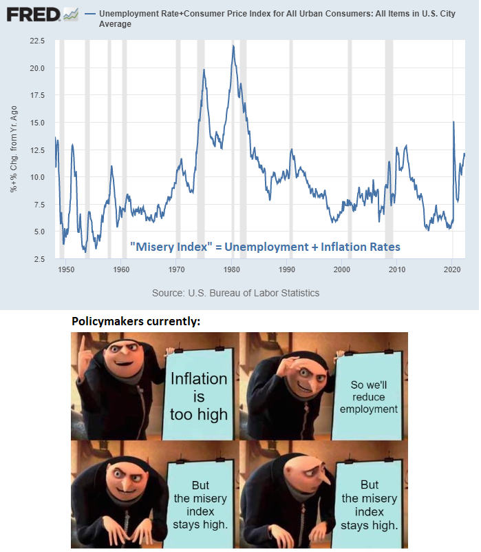
Price inflation continues to be a global problem, and there is also continued evidence of significant economic deceleration and a risk of recession in the United States and Europe.
Weak economic growth combined with high and rising prices (aka “stagflation”) frustrates a lot of academic economic models, but that’s because they are rather focused on the demand side rather than the supply side.
There are real-world supply constraints impacting energy markets and supply chains, which combined with the amount of broad money that was created over the past two years, leads to rising prices without necessarily a lot of real economic growth.
The Inflation Situation
The May CPI print came out on June 10th to some fireworks, because it was higher than consensus expectations. Consensus economists thought it would be 8.3% year-over-year, but it came in hot at nearly 8.6%, representing a slightly higher high.
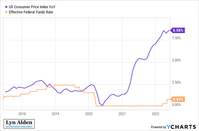
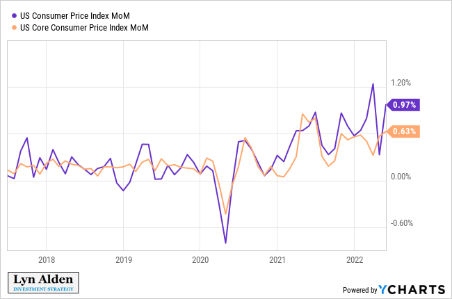
Core CPI is down for two months in a row at 6.01% year-over-year, but continues to run above consensus expectations as well. Here’s the month-over-month chart for headline CPI and core CPI:
Prior to the war back in December 2021, I outlined a 7-9% probable local top in year-over-year CPI by late Q1 or early Q2, and we’re brushing up on the high end of that range here in mid-Q2 with that May CPI report.
The caveat that I gave for right-tail risk (going above 9% or extending past Q2) would be something going crazy in energy markets, which we got partly from the war and other factors. I’m hedged for this scenario by being overweight the energy sector, which I think will do well over the long-term regardless.
In the mean time, I continue to view year-over-year CPI as most likely nearing a plateau for a period of time, but the exact level and the exact timing remains dependent on a few factors. To what extent China re-opens and increases its energy consumption, and to what extent US policymakers continue to try to reign in energy demand and cause a recession, are variables that can affect the timing. I’m ready to change my view if facts change, and Russia’s war already shifted my view towards the higher end of my prior expectation.
Historically, when the money supply expands at a fast rate, it sets up a potential price inflationary situation. The only way to avoid that inflation once so much money is printed, is for there to be significant oversupply of natural resources and/or labor along with a lot of productivity growth. This extra “slack” can make it so that increases in the money supply don’t fully translate into increases in broad price levels. If that oversupply is not there, and organized enough to get to where it needs to be, then an increase in the money supply generally filters through to an increase in prices pretty directly.
When we look at the UK over the past 150+ years for example, we see a rather close correlation between money supply growth and CPI growth. The UK was a developed market throughout this period, with its resources already rather tapped into.
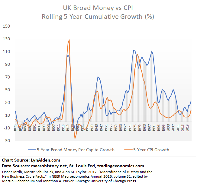
Although the correlation was quite close overall, the biggest disconnect was in the late 1980s, 1990s, and 2000s, when the UK benefitted significantly from labor offshoring. That managed to create a bigger-than-normal gap between money supply expansion and price expansion.
When we look at the US, we see a similar correlation, but with some additional periods of dislocation.
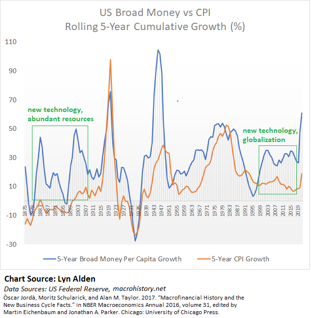
In the late 1800s, the US was an emerging market, and settlers had a whole continent of natural resources and land to tap into (while violently displacing indigenous populations in the process, it should be noted), which led to a lot of physical abundance for those settlers and their financiers. This was combined with the industrial revolution and electrification, which contributed positively towards productivity. So, the US had a big decoupling where money supply could go up a lot while price inflation did not. Foreign capital flowed into the country, and was mostly put to constructive use.
Similarly, throughout the 1990s, 2000s, and 2010s, the US exported a large percentage of its manufacturing capacity overseas to China and elsewhere, to tap into a cheap pool of labor. As a result, the US had a lot of money supply growth, without corresponding domestic wage increases and price inflation. The cost for this decoupling, however, was a widening US trade deficit and rising social and political discontent throughout “flyover country” in the US.
We can see this even more clearly on a chart of US CPI and oil prices, where the 2000s decade had a unique decoupling between the two:
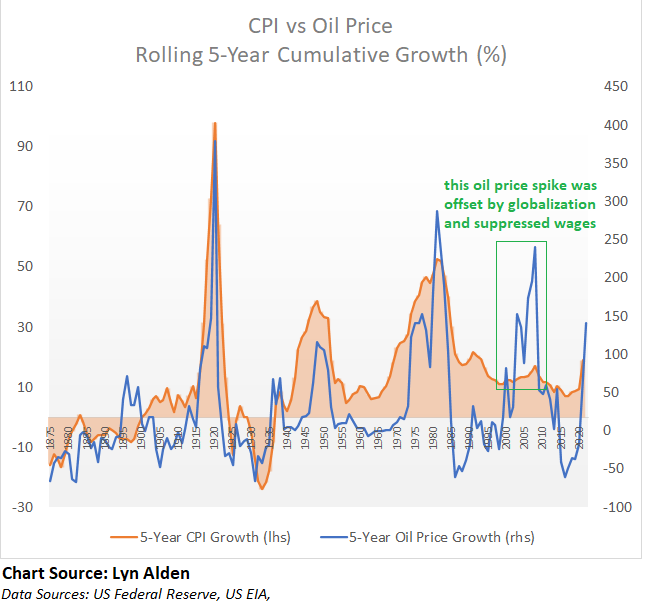
Part of that decoupling was simply due to how the CPI methodology was changed since the 1980s to minimize the impact from house price expansion, but some of it was indeed real decoupling due to suppressed domestic wages.
For the 2020s decade, now that oil is structurally undersupplied rather than oversupplied, and now that Chinese labor is already mostly tapped into, and now that there are rising geopolitical frictions between the West and the East in general, I think we’re looking at a decade where money supply, commodity prices, and broad price inflation are unlikely to decouple significantly, at least when measured properly. We no longer have a big disinflationary reservoir to offset money supply growth with, like we did over the past 25 years or so.
Developed markets likely face a structurally inflationary decade in the 2020s, for the first time since the 1970s, although it likely won’t be a straight line. To the extent that policymakers attempt to reduce demand for goods and services to offset inflation (and thus cause recessions), they may be able to temporarily curtail prices. But as soon as they let up and continue with pro-growth initiatives when the economic pain gets too much, inflation would likely quickly show its face again.
Plus, the geopolitical game theory is messy here. With commodities in short supply, if one powerful country (e.g. the US) prints a lot of money and gobbles up those commodities, it increases the prices for everyone else even if they are practicing fiscal austerity. This is why periods of rising populism and tight supply-side dynamics frequently lead to trade wars or in some cases kinetic wars.
Meanwhile, as the US tries to engineer demand destruction to reign in prices, China could come out of its lockdowns with stimulus and gobble up commodities instead, resulting in continued high inflation for the US as well. That’s why austerity tends to not work for this type of problem, and politicians that try those policies will likely be voted out. There’s no easy way out here.
The only way to return to a long period of disinflationary growth would be to fix the supply side, including re-creating a situation of energy abundance at low prices by bringing multiple types of new supply online. This would be a multi-year capital-intensive process.
Keep in mind that oil is currently priced as high as $120 a barrel despite 1) the US Strategic Petroleum Reserve actively drawing down and selling into the market to try to suppress prices and 2) China remaining under partial lockdown, with for example their current jet fuel usage back down around 2020 pandemic lockdown lows. In other words, oil is priced at $120 despite pretty strong downward pressure being placed on it at the moment by the two biggest countries in the world.
Could oil prices come down sharply from here? Sure. But the demand-side destruction that would be occurring to get to that point, is not something that most people would be happy about.
Heads: people lose. Tails: people lose.
US Business Cycle Analysis
Here is my updated heatmap of various economic indicators for the US economy over the past five years, measured in year-over-year percent change terms. Rather than describing the economy in narratives or qualitative terms, or cherry pick data to fit a particularly bullish or bearish view, it quantifies a broad section of data.
The economic growth rate in year-over-year terms peaked in Q2 2021, while Q3 and Q4 of 2021 had decelerating (but still positive) growth, along with persistently hot inflation. Q1 of 2022 came in with negative growth (but still positive year-over-year), and Q2 of 2022 is pointing in a bad direction as well.
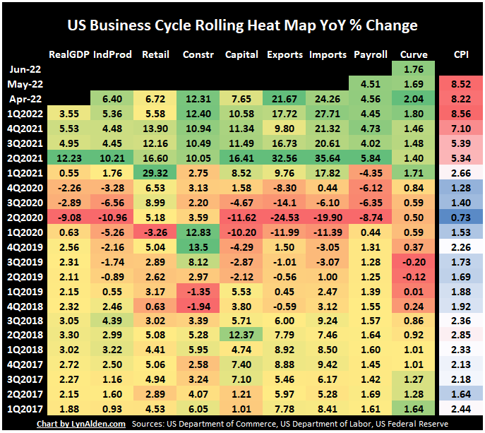
The chart starts from the bottom and goes up over five years, and each column represents one of the economic indicators.
For most of the chart, I use a green/yellow/red color spectrum. Green indicates solid growth, yellow indicates medium, and orange/red indicate slow growth or contraction, relative to the rest of the 5-year period for that indicator. In other words, green is good and red is bad.
For inflation CPI, there is a separate blue/white/red color scale, because high or low inflation in a vacuum is not necessarily “good” or “bad” in the same way as the rest of the heat map. Red indicates higher price inflation, white indicates medium, and blue is lower price inflation, relative to the 5-year period. Economic slowdowns tend to be dis-inflationary while economic booms tend to be pro-inflationary, but there are also some business cycles that slow down with high inflation, and thus become “stagflationary”. So, inflation gets its own color scheme.
Heat Map Indicators Referenced:
- Real Gross Domestic Product
- Industrial Production
- Advance Retail Sales, Excluding Food Services
- Total Construction Spending
- Capital Goods Orders, Nondefense, Excluding Aircraft
- Exports of Goods and Services
- Imports of Goods and Services
- All Employees, Total Nonfarm
- 10 Year Minus 3 Month Yield Curve
- Consumer Prices, All Urban Consumers, All Items in City Average
The heatmap chart is currently worse than it appears at first glance, because several components are based on nominal prices. Retail spending in nominal dollar terms, for example, is up 6.7% year-over-year, which looks reasonable. But considering that official inflation was up more than 8.5% during that time, it means that inflation-adjusted retail spending is down over that period. People are spending more dollars but taking home less stuff with that spending.
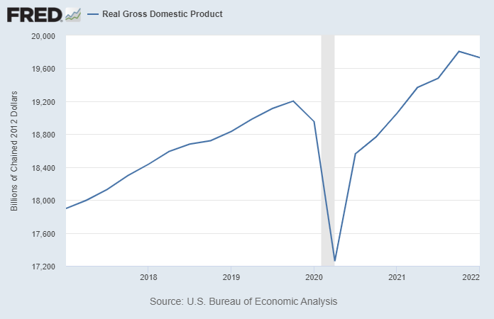
Real GDP already has a negative quarter under its belt for Q1 2022 (although it’s still up on a year-over-year basis), and is at risk of a second negative quarter for Q2 2022.
Atlanta Fed’s GDPNow estimator currently has Q2 2022 real GDP growth at 0.9%. That will change over time as more data come in, and so far it has gone down from their earlier calculations. The official Q1 figure ended up coming in well below what they were estimating for Q1, so we’ll see if that happens again for Q2 or not.
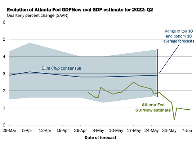
Chart Source: Atlanta Fed
Meanwhile, the ERCI Weekly Leading Index continues to point towards weakness, and possibly negative real GDP growth as well:
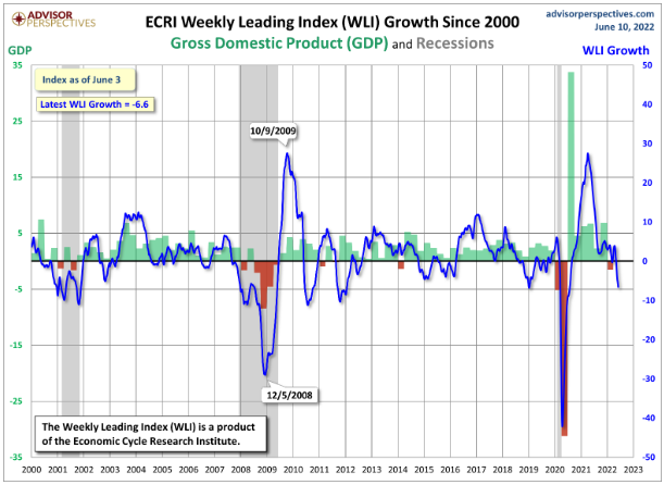
Chart Source: Advisor Perspectives
The yield curve situation is mixed. The 10yr-2yr curve is nearly flat, which is bearish. The 10yr-3mo curve remains steep, which is constructive. This wide gap between yield curves is due to the very wide gap between inflation, current Fed policy rates, and the market expectations about Fed policy rates in the future.
My base case is that the 10yr-3mo curve will begin to flatten as the Fed continues to do 50 basis point hikes over the next 2-3 FOMC meetings.
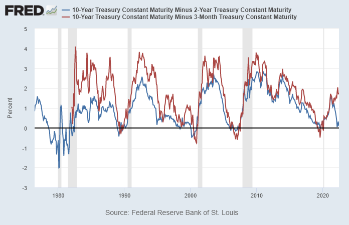
Chart Source: St. Louis Fed
The University of Michigan nationwide consumer sentiment survey recently reported preliminary June figures, and they came in with the lowest reading ever at 50.2. They began this monthly index back in late 1952, or nearly 70 years ago, and this was the worst reading within that entire historical dataset. This looks outright recessionary.
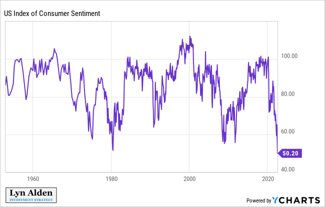
Chart Source: YCharts
Initial jobless claims have had their longest uptrend in this post-lockdown cycle. After two years of lower and lower initial jobless claims (a good thing), we currently have a three-month sustained uptick in jobless claims (a bad thing).
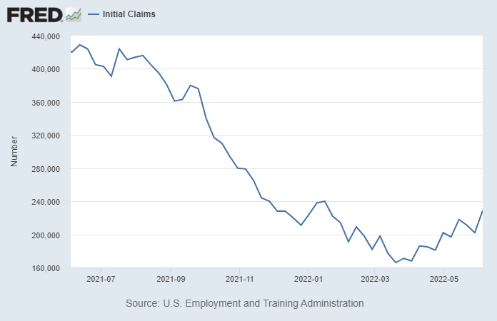
Chart Source: St. Louis Fed
Jobs tend to be a lagging indicator; employers are slow to hire and slow to fire.
Overall, the outlook points towards recession ahead, unless or until some of the facts change.
Policymaker and Economist Confusion
A number of policymakers and economists have expressed confusion as to why consumer sentiment is so low, despite low official unemployment.
I would put forth that they are generally out of touch and not looking at the right data, and specifically that they are blinded by nominal data.
For example, the average wage is up 6.1% over the past year, while broad inflation is up over 8.5%. So, the average person got an inflation-adjusted wage cut of over 2.4% this year; they can buy less stuff with their “higher” wages.
And that 8.5% figure includes a wonky owner-equivalent rent metric, which understates and smooths out actual housing inflation. The “real” cost of living for many people probably rose by low double digits over the past year.
For example, the CPI basket of meat, fish, poultry, and eggs is up 14% during the past year, which is more than twice the rate of average wage growth. Nationwide median rents for new move-ins rose at a similar rate. Gasoline prices are up 57% during that period.
The Case-Shiller US national home price index is up 20% over the past year, while mortgage rates went from 3.0% to 5.5%. The monthly cost of a $300k 30-year fixed-rate mortgage at 3% is $1,265. The monthly cost of a $360k (20% increase for the same house) 30-year fixed-rate mortgage at 5.5% is $2,044. That’s a 62% increase in monthly cost for a mortgage on the same house in the span of a year, due to higher price of the house and higher financing costs.
While wages were up 6.1%.
No wonder consumer sentiment is so low, especially among people who don’t already own a house. People are running in place, with their progress moving backwards over the past year. The money supply expansion of 2020 and 2021 is starting to hit them here in 2022.
The federal government spent over $6 trillion into the economy since the start of 2020, depending on how you measure it. That comes out to around $46,000 per American household.
Did your household receive anywhere near $46,000 in stimulus, directly and indirectly? No? That’s because a lot of it didn’t go to the typical household. Stimulus checks and child tax credits were just a part of it.
A big chunk of it went to PPP loans that turned into grants for some of the richest Americans. This was very helpful for some small businesses, but for other small businesses which had no plans to layoff employees anyway, it went straight to the bottom line of the (often wealthy) owner of that business. Another big chunk went to corporate bailouts, and went to other forms of malinvestment, with the classic Cantillon Effect in action.
The Cantillon Effect describes the uneven effect inflation has on goods and assets in an economy. Since new fiat money is injected into an economy at specific points, its effects are felt by different people and industries at different times. This causes a distortion in relative prices and benefits certain parties while disadvantaging others.
When new money is added to the economy, it will naturally raise the price of goods and assets. However, not all prices will rise by the same amount or at the same time. The Cantillon Effect asserts that the first recipient of the new supply of money has an arbitrage opportunity of being able to spend money before prices have increased.
This is partially due to the fact that new fiat money is created at almost zero cost and given to specific parties, usually banks. These banks have an opportunity to spend this money on goods and assets whose price has not yet reflected the increase in money supply. Banks can thus buy goods at a discounted rate.
As the new money flows from central banks to private banks to investors to ordinary citizens, prices gradually begin to reflect the increase in the money supply. By the time ordinary citizens experience the increased money supply, they will be buying goods at higher prices.
Thus, the flow of new money through the economy is beneficial to parties that receive the funds first, and less beneficial to those that receive it later on. The individuals and institutions closest to the central bank – banks and asset owners – are granted financial advantages at the cost of those least connected to the financial system.
The stimulus efforts could have been done in a more bottom-up way, but were not.
The ironic thing is that to whatever extent fiscal and monetary policymakers are successful at reigning in inflation via their current plan going forward, that will primarily be from demand destruction. In other words, they are trying to create more unemployment and “recession-lite” conditions, in order to reduce demand/supply mismatches and thus reduce prices. At worst, with rising credit spreads, it could mean that supply starts getting restricted as well.
This likely won’t boost consumer sentiment much either for obvious reasons; this isn’t 1980 in terms of the debt or energy situation.
Until energy is abundant and cheap again, and/or wages are rising faster than inflation, consumer sentiment likely won’t be very high. The attempt to reduce demand via a recession is like putting a band-aid over a gunshot wound.
Bitcoin/Crypto Note
With a declining economic growth rate, and the Fed continuing to tighten monetary policy to pull liquidity out of financial markets, bitcoin continues to chop along weakly. There is not much fresh demand for it from outside capital in this environment.
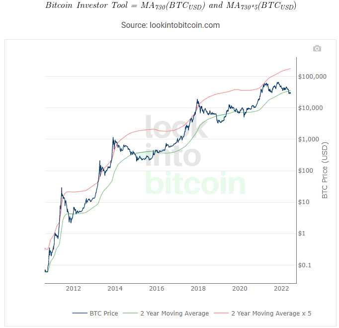
Chart Source: Look Into Bitcoin
I remain uncertain about the price with a 6-12 month view, but remain bullish with a 3-5 year view.
Specifically, I view dollar-cost averaging as the best way to get exposure to bitcoin for most people that want some as part of their asset mix.
Building Atop Bitcoin
Square’s TBD division announced, with some tongue-in-cheek, a plan for “Web5”. Their CEO, Jack Dorsey, has long been critical of Web3 and its affiliation with altcoins, where VCs frequently use retail investors as exit liquidity for their tokens before a viable product truly even exists in a truly useful way.
Square’s open source Web5 plan uses decentralized identifiers that run on a layer on top of the Bitcoin blockchain, along with decentralized web nodes and other technologies. Users would be able to use persistent cryptographic pseudonymous credentials to log into various websites, while retaining control of their own data. It basically offers the promise of Web3, but without altcoins, ponzi-like financial incentives, and various seignorage attached to it.
It’s not released yet, and it remains to be seen how successful this plan will be, but it’s interesting. It’s led at the executive level by Mike Brock, who I met in Norway a couple weeks ago and is serious about this project. Square, as a $40 billion company, has quite a bit of development firepower to throw at this.
Meanwhile, the Lightning network (a second layer network that consists of bitcoin channels and processes fast payments) surpassed 4,000 bitcoins in public capacity, despite the bear market in bitcoin and crypto broadly. This continues to be an area of structural growth in my view. It’s not based on financial incentives, yield farming, or anything like that; it’s based on utility.
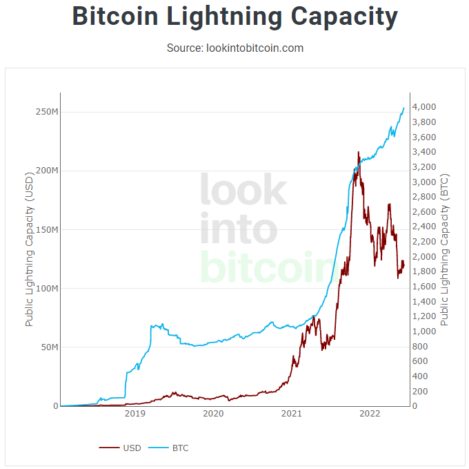
Chart Source: Look Into Bitcoin
Weakness in Altcoins
As weak as bitcoin has been, it has been far worse for the broad cryptocurrency ecosystem. Bitcoin’s share of the cryptocurrency market has risen, as it historically does in bear markets. I described this in my public piece, Digital Alchemy, and the trend has continued since then.
Most of what grew over the past couple years was malinvestment, and it’s being cleared out with 70-90%+ drawdowns in many cases (or upwards of 96% in Celsius’ case and 100% in LUNA’s case).
With some exceptions, most cryptocurrencies that are popular in one cycle tend to not recover their full BTC-denominated gains in the next cycle, so I would be very cautious with various assets outside of bitcoin. Most people today can’t even name what the top ten coins were in the 2017 crypto bull market or the 2013 crypto bull market. Do you think people in 2024 will be able to name the top ten coins of 2021? I’m not sure that they will.
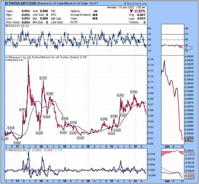
Ethereum, the second largest cryptocurrency and the only one besides bitcoin that often gets treated with blue chip status in the ecosystem, is also facing challenges. The ETH/BTC ratio recently broke down, resulting in a structurally lower high for this cycle compared to the prior cycle:
Meanwhile, the staked-ETH to ETH ratio has been weak lately. Let’s back up and see what that might mean.
Ethereum has had a long-term plan to switch from proof-of-work to proof-of-stake, in what is variously termed “Ethereum 2.0” or “the Merge”. Back in 2015, Ethereum’s co-founder Vitalik said that the switch was perhaps 9-12 months away, and it has been delayed multiple times since then for six additional years and counting.
In late 2020, developers launched the proof-of-stake beacon chain of Ethereum 2.0, with an eventual plan to merge the existing Ethereum 1.0 mainnet onto that chain. Since then, Ethereum holders could deposit their Ethereum into a smart contract and start validating that beacon chain, which earns them yield. Over 13 million ETH have been deposited in this way, representing billions of dollars.
The problem is that this deposit is one-way, until the merge occurs. And this is a problem because the merge keeps being delayed…
However, stakers can still get pseudo-liquidity for their staked ETH. Back in my May 1st report, I discussed the liquid staking derivatives market:
Liquid Staking Derivatives 101
To run an Ethereum 2.0 validator, you need 32 ETH. If ETH is $3k per coin for example, that would be $96k to run a validator. Most people don’t have that amount. Only wealthy people can run Ethereum validators.
So, third parties can stake ETH for normal customers in smaller amounts. Exchanges like Coinbase and Kraken, for example, can take a customer’s ETH with their permission and stake it along with other peoples’ ETH. They run many full validators, and their customers basically have an off-chain claim to a partial validator. The problem with this is that large centralized entities end up controlling a lot of the staked ETH in a custodial fashion, which means they have a lot of influence over which transactions are added to the blockchain.
Smart contracts also popped up to do this, with liquid staking derivatives. The biggest one is called Lido. You can deposit your ETH coin into Lido’s smart contract, and receive a stETH coin in return, which represents your claim on that ETH. This is an extremely attractive solution from a profit point of view because it lets users earn double the interest on their ETH.
Theoretically, staked ETH is supposed to have an opportunity cost compared to using it to earn yield in a DeFi protocol. Users give up DeFi yield, in order to stake their ETH and earn a yield from validation. However, with a liquid staking derivative stETH, a user can have their cake and eat it to. They can deposit their ETH into Lido, receive stETH as their claim on it, and earn the staking yield. Then they can take that stETH coin (which is equal in value to one ETH), and deposit it into a DeFi protocol to earn additional yield on that stETH.
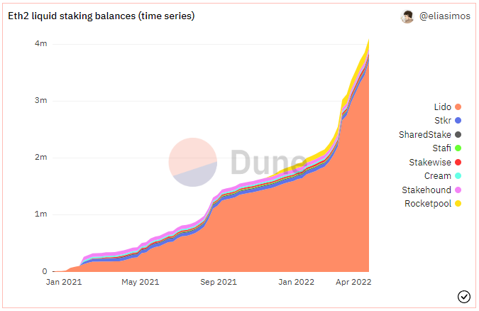
Basically, with this liquid staking protocol solution, users get liquidity similarly to unstaked ETH, while actually staking. And liquidity is a major network effect; a stETH token is a lot more desirable than the derivative coin of a much smaller staking provider, which begets more people staking with Lido and using stETH. Technically anyone can create a new liquid staking protocol, but in practice, it concentrates towards one. Lido has about 90% of the liquid staking market share despite the existence of multiple competitors.
Source: Dune Analytics, @eliasimos
More concerningly, Lido now has nearly 30% of all staked ETH and climbing.
Additionally, processing transactions on a smart contract blockchain offers a lot more arbitrage opportunities than processing transactions on something simple like Bitcoin. Miners/stakers can run complex software analysis to find arbitrage opportunities in terms of how to order their transactions on smart contract blockchains, and this naturally comes with economies of scale. This is called miner extracted value or “MEV”. The combination of liquid staking providers with MEV represents a powerful set of network effects that are likely to quickly centralize the transaction processing of the system post-Merge, unless something is changed.
Bitcoin miners don’t have this issue anywhere near the same degree. Mining has some economies of scale, but it starts to top out pretty quickly. In other words, it’s more cost effective to have 5% of the Bitcoin mining market than only 0.5% of the market due to various cost synergies and economies of scale, but there’s no significant benefit to a miner as they keep going higher than that, and so the ability to reach higher and higher is constrained.
Liquid staking, however, has an actual self-reinforcing network effect rather than just an economy of scale from its MEV, and this can trend towards controlling the majority of the market unless big players deliberately go against their own economic interests and avoid using it.
The risks of this are pretty apparent. The blockchain becomes more centralized, and a large number of staked ETH ends up in a single smart contract that, if it is exploited/hacked in some way, would result in billions of dollars worth of lost funds.
-Lyn Alden, May 1, 2022
As an update, the liquid staking derivative “stETH” now represents about 31% of all staked ETH and is running into some issues.
A number of Ethereum core developers have expressed concerns about delays, technical bloat, and other complications associated with the launch of Ethereum 2.0 in the past couple months. It continues to be delayed in increments of a few months each time. Since staked ETH will only ever be able to be unlocked once the Ethereum 2.0 merge occurs, that’s not great for them.
It seems that the market is losing some confidence about the merge. For the most part, stETH used to trade at approximate parity to ETH, but in recent weeks it has fallen to be worth 96% as much:
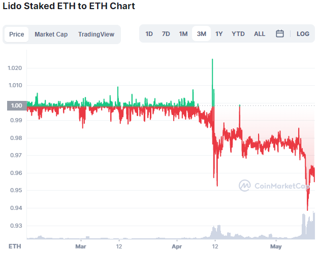
Chart Source: CoinMarketCap
When it was a new and small network, stETH sometimes dipped like this. But this is the first such dip in a long time, and the first dip during a time when it is a huge portion of staked ETH. I would keep an eye on it. Constructive news about the merge might re-peg it, but a lack of that news might make it worse.
One of the problems with DeFi is that people use it for recursive leverage. For example, they deposit ETH into a liquidity pool and get stablecoins in return, collateralized by that ETH. Then they take those stablecoins, deposit them into a liquidity pool, and get some other token, collateralized by those stablecoins, and then deposit that other token, and so on. There are various arbitrage opportunities to get high yields from layers of rehypothecation, and so there’s a lot of rehypothecation in the ecosystem in general. The same sort of recursive thing is happening with stETH arbitrage; some big players could really blow up if the stETH/ETH spread gets too wide for a persistent period of time.
I would personally avoid having any significant deposits in crypto yield platforms going forward in this bearish environment.
I expressed technical concerns about the conversion to Ethereum 2.0 back in my January 2021 critical article on Ethereum, and those concerns are seemingly starting to materialize. I updated this view in my November 2021 critical piece on proof-of-stake systems in general.
Overall, Ethereum is the other blockchain besides Bitcoin that has a both pretty serious network effect. However, in addition to the problem of its increasing technical complexity and delays, its use-case has primarily been serving as a platform for launching and trading altcoins and NFTs, which are highly speculative assets that historically don’t retain their value for very long.
In that sense, for all practical purposes Ethereum could be considered the world’s largest casino by market capitalization, at least in its current and historical state.
This makes it pretty risky in my view, and thus I continue to have a mostly bitcoin-focused approach within the cryptocurrency market.
Portfolio Updates
The portfolios are available in my Google Drive.
Newsletter Portfolio
-No current changes.
Fortress Income
-No current changes.
ETF-Only Portfolio
-Reduce RSP from 16% to 15%. Reduce GUNR from 7% to 6%. Reduce VEA from 14% to 12%.
-Add a 4% allocation to AMLP.
No Limits Portfolio
-Sell ITOCY. Buy 40 shares of AMLP.
I am not bearish on ITOCY, but MITSY is currently my preferred Japanese trading company stock to focus on for this portfolio.
Energy pipelines, in the form of AMLP, offer more compelling 3-5 year risk-adjusted return opportunities than ITOCY from current levels, in my view.
Top 12 List
-No current changes.
Other Holdings
-No current changes.
Energy Transfer Stock Analysis
Energy producers are getting a lot of attention lately, and sentiment is starting to get pretty strong for them, which is somewhat of a contrarian indicator.
However, there aren’t really any signs of euphoria. Large pools of capital remain underinvested in the energy sector, and there is not a lot of retail investor enthusiasm either. While the space will certainly have corrections along the way, and a few stocks like Chevron (CVX) might be getting a bit stretched here, I think we’re still early in a structural bull market for energy, after a long bear market.
Compared to producers, the master limited partnership pipelines remain more under-owned by investors, and have less risk of a deep correction in my view. Especially for ones that issue K-1 forms, there are basically no tourist investors or retail speculators in them; they tend to filter for people who actually want to own them for years and collect distributions.
The Wash-Out of the MLP Industry
For a couple decades, master limited partnerships operated with “ponzi-nomics”. They kept growing bigger and bigger with unit issuance and debt issuance, and many were quite leveraged. This mostly ended in 2015.
During the 2010s decade, North American shale oil ramped up and began creating a supply glut. The Fed ended QE3 in 2014, which led to a rapidly strengthening dollar, which put pressure on dollar-indebted emerging markets, and reduced their economic growth rates. The combination of excess new oil supply and multiple severe emerging market recessions that reduced demand for oil, led to a collapse in oil prices. OPEC also tried to flood the world with oil to crush US shale production, which for the most part did not work but did contribute to a lot of blow-ups across the shale sector.
Even many pipeline businesses that were not heavily exposed to oil prices, were heavily affected by this because there was less demand for their constant equity and debt issuance in a bearish energy environment. So, many pipeline businesses “blew up”, lost a lot of capital, had to cut distributions, had to sell assets in an unfavorable part of the market cycle, and so forth.
Some of them that managed to barely make it through that period intact, limped along for a few years, and eventually blew up during the 2020 oil crash. This includes Energy Transfer Partners (ET), which is one of the biggest midstream businesses in the United States. They had to cut their distribution in 2020.
Only the strongest (least leveraged and best managed) pipeline businesses were able to make it through this whole period without distribution cuts. This includes names like Enterprise Products Partners (EPD) and Magellan Midstream Partners (MMP).
However, I now view the industry as rather washed out. Valuations are reset, they’ve shifted to mostly self-financing models with lower distribution payout ratios, and the space in general is much more investable than it used to be.
Energy Transfer Overview
My favorite risk-adjusted MLP has been Enterprise Products Partners (EPD), which has a big emphasis on natural gas liquids, petrochemicals, and refined products, with smaller natural gas and crude oil segments. They are one of the few that managed to avoid overleveraging and avoid distribution cuts throughout this whole multi-year bear market.
However, I’m increasingly bullish on Energy Transfer Partners (ET) as well. Their focus is more on natural gas, and while they have historically not been as conservatively managed, I view them as a good complement to EPD in this environment of persistent energy shortages. I think their period of pain is probably behind them.
Here’s ET’s map of operations:
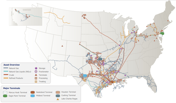
Source: ET May 2022 Investor Presentation
And here’s their EBITDA breakdown by segment:
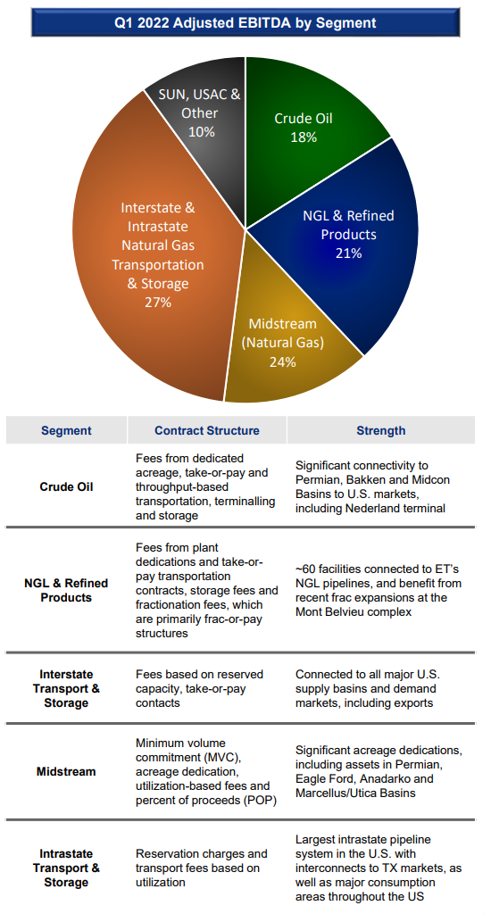
Source: ET May 2022 Investor Presentation
Energy Transfer is quite focused on transporting natural gas, which accounts for about half of its business (orange and gold segments of the pie chart above). The rest is divided into crude oil, natural gas liquids, refined products, and other businesses.
Valuation and Leverage Analysis
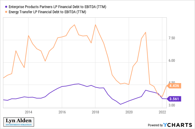
ET has more leverage, weaker operating history, and lower credit ratings (BBB- vs BBB+) than EPD. So why own it?
In short, it’s very cheap, and has more upside potential after a big wash-out. It’s a more aggressive play on the industry.
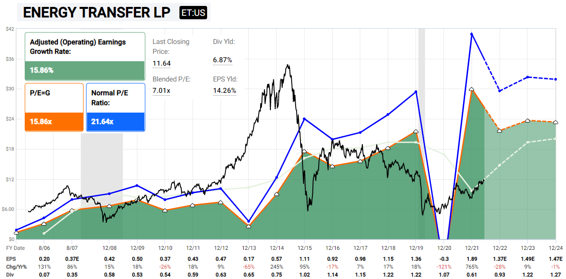
Chart Source: F.A.S.T. Graphs
In addition, more of its operating income is actually free cash flow now. Rather than sending out all of its earnings (and then some) as distributions, ET now has a pretty low payout ratio compared to the rest of the industry, despite offering a 6.8% distribution yield.
ET historically operated with much higher debt/EBITDA than the most conservative MLPs, which is part of what caused it to run into trouble over the years. However, its leverage has now come down quite a bit relative to its EBITDA, as they focus on net debt reduction:
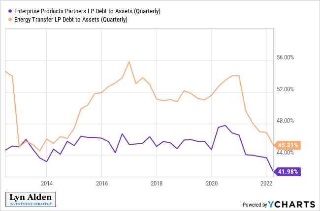
Its debt/assets ratio has historically not been as bad. This does, however, indirectly point to the fact that ET generates less EBITDA as a share of its assets than EPD does.
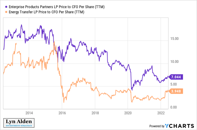
To account for this (and probably over-account for this), ET’s equity is priced very cheaply. Here they are on a price to cash flow basis:
And here they are on an EV/EBITDA basis:
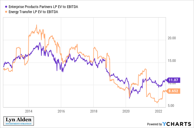
I remain structurally bullish on the North American pipeline industry with a 3-5 year view. Valuations are low after a multi-year bear market, weak business models have already been busted, there is little speculative money in the sector, and they are primed for decent risk-adjusted total returns, mainly from their distributions but also from a gradual grind higher in unit prices.
EPD remains my preferred risk-adjusted play. ET represents my more aggressive view on the sector, albeit I would be more cautious with its position sizing.
Alternative Exposure: Alerian MLP ETF
For investors that want exposure to the MLP industry without dealing with single-business risk or K-1 forms during tax season, the Alerian MLP ETF is a decent way to get exposure.
Until the past year, I’ve generally avoided this ETF because I didn’t like the majority of pipeline businesses, and only wanted exposure to the absolute best. However, now that a long bear market has broken most of that which can be broken, I’m more broadly bullish on the industry than I used to be. I added AMLP as a small position to the Fortress Income portfolio a while back, for this reason.
ET is currently the largest holding for AMLP at 11%, although the top holdings are all pretty close and tend to trade rankings over time. Other holdings such as WES, EPD, MMP, PAA, and MLPX each generally represent 9-11% of the fund at any given time.
The expense fee is 0.87%, which is a tad high, but it saves investors from having to deal with K-1 forms. It pays out a nearly 7% distribution yield and gives broad exposure to US pipeline businesses.
Risk Analysis
Pipelines depend on decent product volumes to generate good returns.
During periods of major US oil and gas production growth, they can issue debt, issue equity, or use cash flow to heavily invest in capex to bring new profitable pipelines to market, in order to get that production to refineries, to consumers, and to export terminals.
During periods of sluggish US production, they can reduce capex, reduce or eliminate debt and equity issuance, and focus their cash flows towards debt reduction or unit buybacks.
In years prior, many MLPs were reliant on issuing debt and equity all the time, but now most of them are more flexible in this regard, and have become more self-financing.
Because so much of the infrastructure is focused around the Gulf Coast, there is always risk that a super-storm hurricane could severely impair the industry more than normal. This can be hedged by owning oil producers or oil futures. That’s why I like to own both producers and transporters of energy.
My Overall Energy View
Energy bull markets generally end after years of new supply coming online, resulting in oversupplied conditions. So far, there is no significant supply response to these high prices and shortages.
The market is still pricing this energy problem as being transitory, with cheaply-priced oil futures for 2024 and 2025 compared to current prices. Producers aren’t investing much in long-duration projects. Pipeline capex remains mediocre overall.
I think we’ll get pullbacks along the way, and as I said previously, I think Chevron stock for example is getting a little ahead of itself here. However, I think that the energy sector overall will “climb the wall of worry” in the years ahead. There is still a lot of investment to do in the space. Pipelines in particular don’t have much froth in them at the moment.
Some people are saying that energy is in a bubble, but I look at it as being slightly overbought and still healthy overall. Here’s a total return ratio chart of the energy sector vs the broad S&P 500. When the line is going up, energy is outperforming, and when it is going down, it is underperforming:
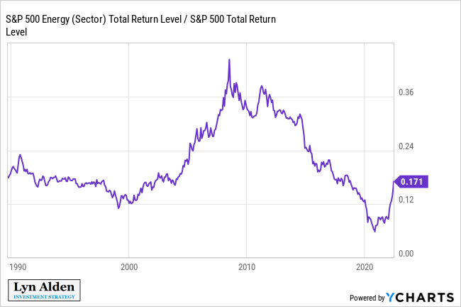
This recent move is basically just a retrace back to a pre-COVID period. The speed with which it went up is a bit concerning in the near-term sense, but the magnitude is not a concern. I think the ratio has farther to go up in the years ahead, in a zig-zag line up and to the right. Abundant energy is currently a key bottleneck for global growth, and OPEC already seems to be near their maximum capacity.
Pipelines with K-1 forms in particular don’t seem to have any over-exuberant froth in them. I expect the next few years to be choppy for broad equity markets, and so businesses that mostly focus on cash distributions should hold up pretty well in comparison.
Final Thoughts
While 1) the US economy is slowing, and 2) the Fed is tightening monetary policy and draining liquidity from the market, I remain defensive overall.
There will be bear market rallies when sentiment gets overdone to the downside, but until there is some reversal in one or both of these two variables, there is not a strong reason to be outright bullish on broad risk assets.
Once we start to see a reversal in one or both of those variables, however, things could get interesting to the upside. And particularly, the market will probably front-run the Fed, so if we see market expectations of forward Fed rate hikes hit a peak and roll over, that could be a key bullish catalyst on rate-sensitive assets prior to the Fed’s actual pause on rate hikes.
The market is currently pricing in a faster Fed rate-hike scenario than the Fed’s own projections. In particular, they are starting to price in a decent probability of 75 basis point hikes in the months ahead.
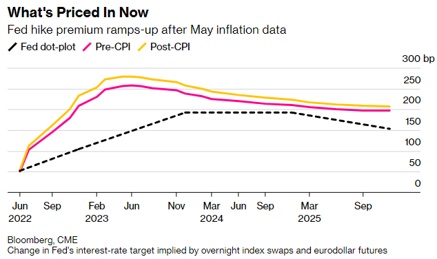
Chart Source: Bloomberg
While it’s possible that the market is right, I view the Fed as likely being unable to tighten as quickly as the market expects, especially by the end of this year, due to increasing recession risk, stressed credit markets by then, and the high level of debt in the system. If they indeed stick to 50 basis point hikes rather than moving towards 75 basis point hikes in the months ahead, we shouldn’t be surprised to see some relief rallies in equities, gold, bitcoin, and assets like that.
Europe is in a similar position as the US overall, but way worse in terms of energy security and political complications, and better in some other aspects.
Some emerging markets, such as throughout Latin America and southeast Asia, are more interesting, especially once we get past peak expectations of Fed tightening. Plus, Chinese assets could see a big move up as they come out of lockdowns (which is still a big “if” because their policy still seems all over the place in that regard), and there are already preliminary signs of a bottom in Chinese equity ETFs like MCHI and KWEB.
I continue to prefer value equities to growth equities overall, and expect that the 2020s decade will be one of value outperformance after the 2010s decade of growth outperformance, but I maintain a bit of both in most of my portfolios.
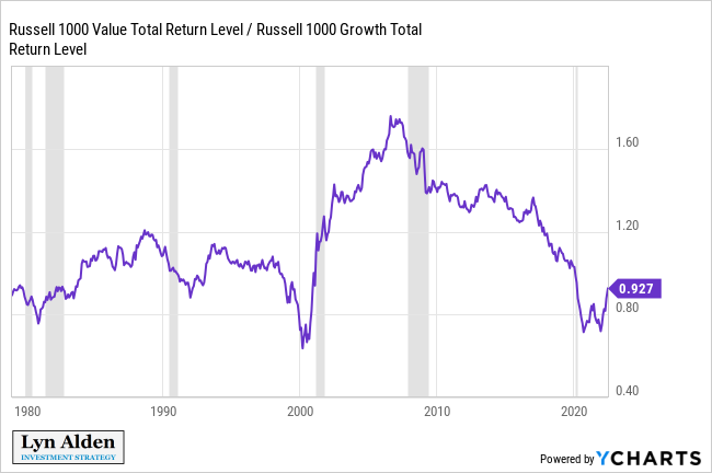
Chart Source: YCharts
This remains a very uncertain period overall, with decades of cumulative policy errors starting to materialize in the form of high inflation and record low consumer sentiment.
Since my December 2th 2021 report, I have been arguing for a more defensive stance, and that view has held up pretty well. Healthcare stocks, pipeline stocks, gold, cash, and other “defensive value” assets that I’m overweight across my portfolios are generally flat or up this year, in the face of a sharp sell-off in broad equities and bonds. However, some of our smaller allocations to growth assets like bitcoin and ARKK-style stocks have taken a price hit.
I continue to have a defensive and value-oriented outlook overall, in line with my December 2021 view, until we see policymakers capitulate on their attempt to tighten monetary policy into an economic slowdown. Due to how high headline inflation is, this likely won’t happen until either something in financial markets breaks (e.g. the credit market or the Treasury market goes illiquid), or a recession is realized.
