Market Analysis for May 9th, 2021
 By
By
Inflation is a controversial and complex topic. This article looks at 150 years of data across multiple countries to provide a general idea of what inflation is, what to look for, and how to invest with inflationary and deflationary risks in mind.
I'll break it into two parts because I'm running into character limits.
Definitions: Three Types of Inflation
Merriam-Webster defines inflation as “a continuing rise in the general price level usually attributed to an increase in the volume of money and credit relative to available goods and services”.
In other words, if the number of currency units in the system goes up way more than the availability of goods and services in the economy, then we can get supply shortages and price increases.
That dictionary definition is a good place to start, but opens up some obvious questions. Which goods and services are we measuring the price level of when we quantify overall price inflation levels, and with what weighting? Can there be instances where the volume of money and credit goes up a lot and yet prices still remain low, and if so, why would that happen and what would we call that?
This leads to a debate of definitions. Economists of different schools of thought often speak past each other about what inflation is. So, rather than debate which definition is best, we can define three types of inflation, and go from there.
Monetary Inflation
Monetary inflation generally refers to an increase in the broad money supply, such as M2. In other words, it’s not about prices going up; it’s about the amount of money in the financial system going up.
Broad money supply, M2, refers to all of the various bank deposits for people and businesses that exist in the system, like checking accounts and savings accounts, as well as physical currency in circulation. There are alternative measures of broad money that can include additional types of cash-equivalents as well.
This chart shows the US broad money supply over time in blue on the left axis, and the year-over-year percent change in that broad money supply in red on the right axis:
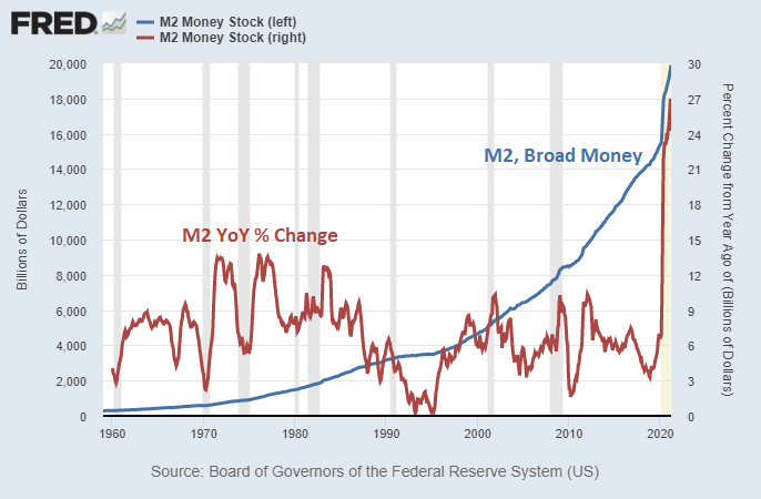
Chart Source: St. Louis Fed
There are two main forces that drive up the broad money supply over time: either banks make more private loans and thus create new deposits (which increases the money multiple, the ratio of broad money to base money), or the government runs large fiscal deficits while the central bank creates new bank reserves to buy large portions of the bond issuance associated with those deficits (which increases both broad money and base money).
This chart shows the growth in private sector loans, government deficits, and broad money growth, as a percentage of that year’s GDP for the United States since 1881:
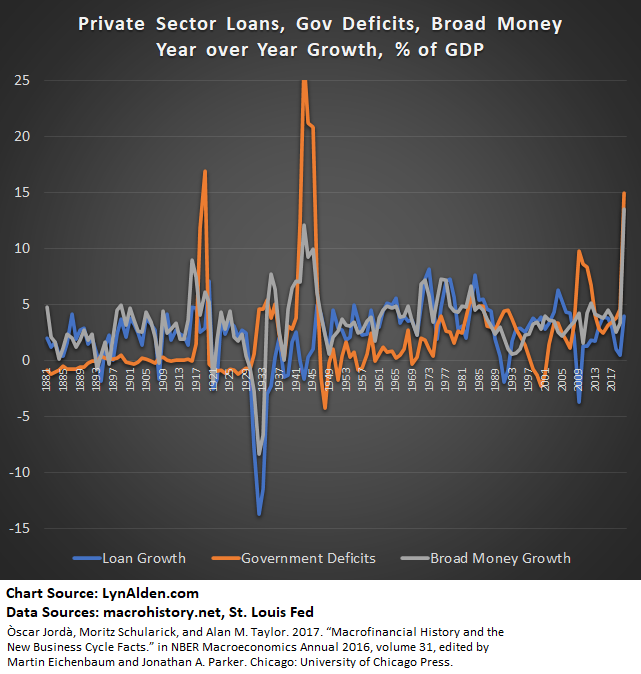
We can see on that chart that the 1880s, 1890s, and 1900s decades, as well as the 1950s and 1960s decades, were characterized by strong loan growth and low government deficits. The private sector drove the creation of money. We also see major banking crises, such as the Panic of 1893, the Great Depression (early 1930s), the Savings and Loans Crisis (early 1990s) and Great Financial Crisis (2008/2009), where loans collapsed.
On the other hand, during instances like the 1940s and the 2020s so far, it was government deficits that drove broad money growth, rather than private sector loan growth.
Monetary inflation is generally a starting point for the next two forms of inflation: consumer price inflation and asset price inflation, which we feel more directly.
Consumer Price Inflation
Consumer price inflation is when the nominal price of a broad set of goods and services goes up. In other words, if you paid $4 for a Big Mac five years ago, and $5 for a Big Mac this year, then it inflated 25% in price at an average annual price inflation rate of 4.56% during that period.
Some goods or services can have unique supply/demand balances that affect their price, so we can’t focus on single goods or services when measuring inflation. When the majority of goods and services start going up in price, that’s consumer price inflation. The value of the currency itself is what is losing purchasing power in that case, rather than a specific product or service going up in price.
The difficulty with this measurement is coming to an agreement on a basket of goods and services to measure the price of. If we cherry-pick certain types of goods or services, we can make consumer price inflation seem higher or lower than it really is. And if certain goods or services improve in quality, how do we factor that into year-over-year price changes?
For example, if the new Toyota Camry car has gone up a lot in price compared to then-new Toyota Camry cars from a decade ago, but comes with a ton of extra features thanks to new technology compared to back then, how do we measure its price inflation? We can easily measure the price inflation of a simple commodity like copper or aluminum that doesn’t change at all over time, but how do we maintain an apples-to-apples price comparison for complex items like Toyota Camry cars? Governments use a hedonic adjustment to adjust for this, but naturally it is prone to debate. So, we already have an area of inevitable controversy.
And then how do we weight prices? If “Household A” spends 40% of their expenditures on housing, 20% on transportation, 10% on education, 10% on healthcare, and 20% on all other categories combined, while “Household B” is much richer and spends only 20% of their expenditures on housing, 10% on transportation, 5% on education, 5% on healthcare, and 60% on all other categories combined, then how do we weight various products and services into a formula to determine the actual rise in prices as it relates to most people?
If, thanks to improving technology and changing lifestyles and work habits, the typical mix of expenditures for the median household changes over time, should we change the basket of goods and services that we are measuring the price of to reflect that? Or should we keep the basket of goods and services fixed for the sake of consistency, even if it becomes less relevant for the typical household over time?
Quite often, consumer price inflation is tied to commodity price inflation. If oil, copper, lumber, and other key commodities are abundant and cheap, it puts downward pressure on most types of prices. On the other hand, if there are supply constraints of major commodities relative to demand, then commodity prices go up a lot, and that trickles into other prices because the cost to make them and transport them goes up.
This chart shows the consumer price index and the commodity producer price index since 1913, which was when the Federal Reserve was founded. We can then divide the period since then into two halves due to a significant change in monetary structure that occurred in 1971:
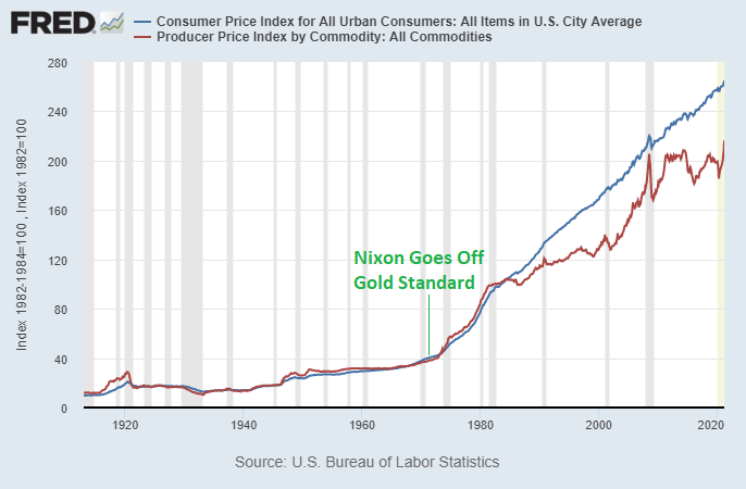
Chart Source: St. Louis Fed
What that consumer price index chart shows, is that a basket of goods that would cost $100 in 1982, would cost $265 today, and would cost about $10 in 1913. The price of a basket of goods, in other words, has risen over 26x from 1913 to today in dollar terms. Breaking that down further, it rose by about 4x from 1913-1971 (58 years) when Nixon took the US off the gold standard, and about 6.5x from 1971 to 2020 (49 years).
As I described in my article on the petrodollar system, the 1971 dollar-gold breakdown realistically failed in the late 1960s, and was inevitable by 1971 when it was made official.
To give a bit more granularity, this chart shows the year-over-year percent change in the consumer price index, which is what we generally refer to as price inflation:
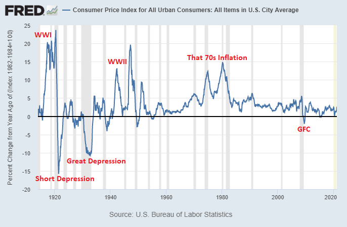
Chart Source: St. Louis Fed
Prior to 1971, there were both periods of inflation and deflation. Since 1971, there have been periods of inflation, but barely any periods of deflation, due to different mechanisms and goals that policymakers have as it relates to monetary policy.
Asset Price Inflation
Asset price inflation refers to the prices and valuations of financial assets, like stocks, bonds, real estate, gold, fine art, and collectibles increasing over time. These are things that can be held for a while and tend to appreciate in price over the long term.
There are multiple ways to measure asset valuation, and I use several of them throughout my newsletters and articles. None of them are perfect, which is why I use several to see if they agree or don’t agree.
Here is US household net worth as a percentage of GDP in blue (currently 600%, left axis) and short-term interest rates in red (near zero, right axis):
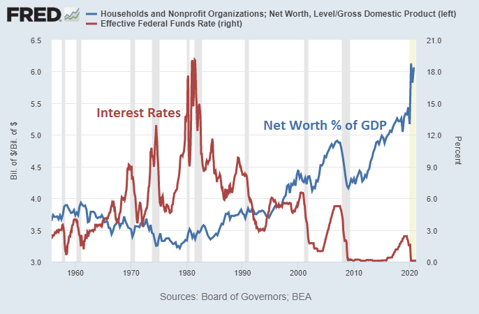
Chart Source: St. Louis Fed
Household net worth includes stocks, bonds, cash, real estate, and other assets, minus liabilities like mortgages and other debts.
Asset price inflation often happens during periods of high wealth concentration and low interest rates. If a lot of new money is created, but that money gets concentrated in the upper echelons of society for one reason or another, then that money can’t really affect consumer prices too much but instead can lead to speculation and overpriced buying of financial assets.
Think of it like this. If the government and central bank were to create a trillion new dollars and give the 100 richest people in the country an extra $10 billion each with that money, what would they spend it on? All of their physical needs and desires are met many times over already. They’re not going to eat better, travel more, or really do anything differently in terms of personal consumption than they’re already doing. Instead, they’ll buy more financial assets, like more stocks or real estate, and push those prices up with this extra demand. This money won’t get out and push the prices of things like copper or beef up.
On the other hand, if the government and central bank were to distribute $5,000 to every American adult who makes less than a million dollars (which would be in the ballpark of 200 million people, and thus also total up to $1 trillion in brand new money), then a significant portion of them would spend that money on everyday goods, and push up many consumer prices as demand outpaces supply for a period of time. This is money that would actually lead to more consumption and circulate more.
Due to tax policies, automation, offshoring, and other factors, wealth has concentrated towards the top in the US in recent decades. People in the bottom 90% of the income spectrum used to have about 40% of US household net worth in 1990, but more recently it’s down to 30%. The top 10% folks saw their share of wealth climb from 60% to 70% during that time. When broad money goes up a lot but gets rather concentrated, then the link between broad money growth and CPI growth can weaken, while the link between broad money growth and asset price growth intensifies.
Money Supply vs Consumer Price Inflation
Over the very long run, we should expect technology to continually improve and push prices down. For example, people use to farm by hand. Then, the invention of the tractor and similar equipment empowered one person to do the work of many people. And then, we can imagine a fleet of self-driving farming equipment allowing one person to do the work of a hundred people. As a result, a smaller and smaller percentage of the population needs to work in agriculture in order to feed the whole population.
However, money creation processes and other policy choices can create inflationary results that offset those technological price reductions.
In general, per-capita money supply growth is one of the most closely-correlated variables to consumer price inflation, and this section takes a look at that relationship over 150 years.
For this set of charts for 1875-2020, I used the 1870-2017 academic database from macrohistory.net and added 2018-2020 data from the St. Louis Federal Reserve. Here is the full citation for that macrohistory dataset:
Òscar Jordà, Moritz Schularick, and Alan M. Taylor. 2017. “Macrofinancial History and the New Business Cycle Facts.” in NBER Macroeconomics Annual 2016, volume 31, edited by Martin Eichenbaum and Jonathan A. Parker. Chicago: University of Chicago Press.
Example 1) The United States
This chart shows the rolling 5-year cumulative percentage increase in the consumer price index for the United States compared to the rolling 5-year cumulative percentage increase in the broad money supply per capita:
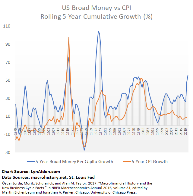
Individual years can be very noisy. By looking at 5-year rolling total increases rather than 1-year fluctuations, we can filter out the noise and look at periods of significant and persistent broad money growth and price inflation.
We see that the chart has a rather strong correlation; broad money supply growth and the consumer price index growth often go up or down together. Thanks to productivity gains (real growth), broad money supply usually grows faster than CPI. There are some notable periods where the disconnect is larger than usual, and worthy of review.
Examining the Exceptions
The 1875-1910 period and the 1990s-present period are two notable times on that chart where broad money grew rather quickly without causing significant price inflation, and are worth exploring. In other words, these are the “exceptions” where the correlation wasn’t as close as the rest of the time.
For the first exception period in the late 1800s, that chart basically shows a technological revolution and the rise of a superpower, which kept prices low and allowed for tremendous growth. The United States had abundant land as the population spread out west across the continent (displacing the natives, to put it lightly), which put downward pressure on prices. Cheap labor immigrated from around the world to work in the United States. Huge amounts of oil was discovered, and Standard Oil was founded in 1870 and made vast improvements in refining and transporting techniques. The transcontinental railroad was completed in 1869, Edison commercialized the light bulb, various folks including Tesla and Edison led to broad electrification, and the internal combustion engine was invented. Modern sanitary techniques became widespread, to reduce disease and improve healthcare and longevity. The banking system grew as a share of GDP from tiny to significant. So, money supply could grow a ton, and it was all real growth towards massive gains in productivity rather than inflation. The dollar was on a gold standard as well.
For the second exception period from 1990s-present, we had another technology revolution with the creation/adoption of the internet and smart phone, with a proliferation in software. The exponential increase in computer power and networking allowed us to digitize a lot of our equipment and processes. With the fall of the Soviet Union and the subsequent expansion of free trade agreements as impoverished areas opened up economically to interface with developed countries, globalization accelerated around the world. Corporations outsourced domestic labor to cheaper places like Mexico and China and eastern Europe, which put downward pressure on domestic wages and prices in wealthy nations. The rise of automation also displaced quite a bit of labor and put more downward pressure on wages and prices. Additionally, the CPI calculation method changed during this period, and there is a discussion on that later in this article.
What about Velocity?
There is a common idea that high monetary velocity (GDP divided by broad money supply) is needed for inflation. However, the data show that this is not the case.
Here is the rolling 5-year cumulative percentage increase in the consumer price index on the left axis, compared to broad money velocity each year on the right axis:
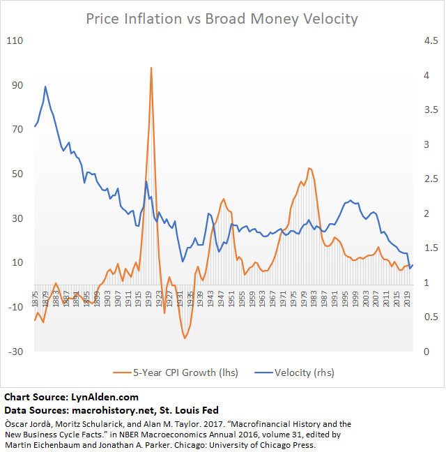
Monetary velocity was extremely high and declining in the late 1800s, while inflation was low and rising. Velocity had periods of temporary correlation with inflation during World War I and the Great Depression, and not much correlation with inflation during World War II. In the 1970s, velocity wasn’t any higher than the 1950s or 1960s, and yet inflation rose substantially. In the 1990s, velocity went up noticeably, but inflation went down.
Brief periods of collapsing velocity are generally deflationary shocks, which contributes to the idea that velocity is the key variable for inflation, but in general, inflation is far more correlated to broad money supply per capita than it is to monetary velocity.
Example 2) The United Kingdom
In the previous example of the United States, we saw the rise of a superpower with abundant new land and resources that took the mantle of the global reserve currency.
With this example of the United Kingdom, we instead see the gradual decline of a superpower and loss of the global reserve currency. Here is 5-year rolling cumulative broad money supply per capita growth vs 5-year rolling CPI growth:
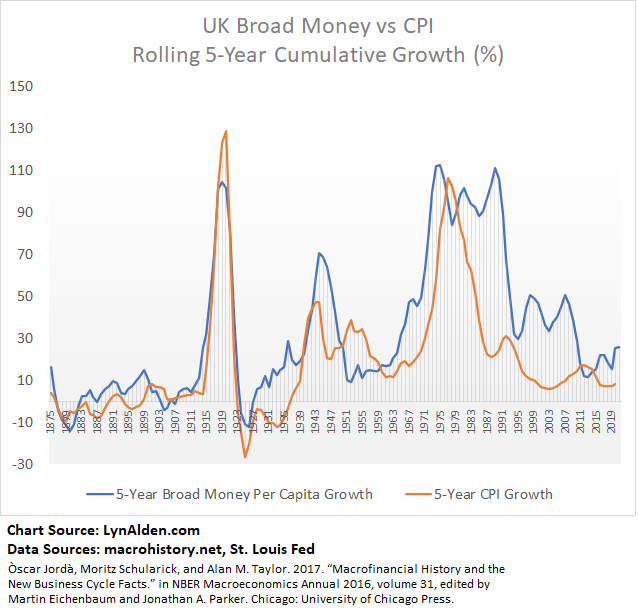
This chart has even tighter correlation between broad money supply per capita and price inflation than the United States. There was no free and abundant land in the 1800s for the United Kingdom like the United States had, so broad money and inflation went more closely in hand.
Example 3) Japan
The United States and United Kingdom never outright lost a critical war during this period. Japan, however, was devastated during World War II and experienced hyperinflation upon their loss. So, that makes for another instructive example:
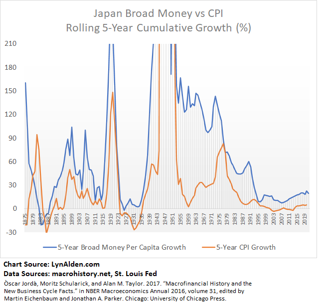
Japan spent the earlier half of this chart as an emerging market, and then became an imperial power and developed market later on.
Similar to what the United States experienced in the late 1800s after the American Civil War, Japan experienced what was known as an “economic miracle” from the 1950s to 1990 after World War II. We can see on the chart, there was a large gap between broad money growth and price inflation, as Japan rapidly re-industrialized and became an extremely efficient exporter. Money supply went up a ton, but so did goods and services, which kept prices in check.
More recently, people often wonder why Japan didn’t experience high price inflation in the past two decades, due to how much it expanded its central bank balance sheet. The answer is clear on the chart; Japan had very low broad money supply growth over the past two decades.
Example 4) Australia
As our final example, here’s the chart for Australia, which had pretty strong correlation throughout the period:
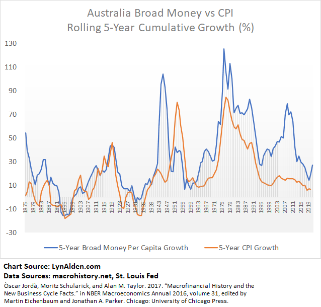
The rise of China as a major trading partner from the 1990s through the 2010s gave Australia an economic boost, where their money supply could grow a lot faster than CPI. The country went 28 years without a recession from 1991 through 2019.
How Accurate is the Consumer Price Index?
The CPI attempts to accurately report the changing cost of a representative basket of goods and services. Over time, some of those goods and services are inflating or deflating in price, being substituted out, and being weighted into the overall calculation in changing ways.
And there have been changes to the CPI calculations along the way, to use more quality adjustments.
There are many people who believe that CPI, especially due to changes in that calculation over the past few decades, understates the true inflation rate in the United States. House prices, food prices, healthcare prices, and tuition prices are all rising faster than CPI, and they represent the bulk of middle-class household expenditure. Sometimes proponents of this idea are dismissed as “inflation truthers”, since they push back on expert numbers and assert that CPI is manipulated in favor of a narrative.
On the other hand, there are folks like Brent Moulton who have worked in government that think CPI overstates the real inflation rate. The general argument is that despite more widespread use of hedonic adjustments in CPI, it still hasn’t been enough to capture the true growth of technology and digitization that has pushed down the cost of living.
Back in 2011, there was a widely-reported interaction where then-NY-Fed Chairman William Dudley was speaking with an audience in Queens NY, and received a lot of questions about food inflation which was running hot at the time. As Reuters reported, Dudley responded by saying you have to look at all prices, and that for example an iPad 2 just came out for the same price as the iPad 1, but was far more powerful, and thus on a quality-adjusted basis is way cheaper. Someone in the audience yelled back that you can’t eat iPads.
The power of technological deflation is important not to overstate, though. In everyday use, the rise of the smart phone displaced a lot of house phones, cameras, video recorders, film, CD players, iPods, beepers, radios, scanners, roadmaps, and many ATMs. They also displaced a big percentage of physical newspapers, calendars, dictionaries, encyclopedias, and books. In more niche areas they displaced some mobile game devices, pocket translators when traveling, compasses, voice recorders, and photo scrapbooks. We folded many of our devices and consumables into one powerful device with dozens of software applications.
In a 90s episode of the comedy show Friends, a traveling encyclopedia salesmen played by Penn Jillette tried to sell Joey a full physical encyclopedia for $1,200. Joey was broke, however, so he only bought the book for topics starting with “V” for $50 and became a niche expert in that letter.

That was less than 25 years ago. Today, we access countless things like that for free anywhere as part of a phone/internet cost.
So we have a bit of a populist vs academic feud here about whether official broad CPI accurately captures rising prices due to money supply growth. Who’s right? Folks paying for things in the real world, or academics with models and the numbers in front of them?
There are some number-crunchers supporting the inflationary view too, though. John Williams’ Shadow Stats, for example, calculates that annual price inflation has been around 5-10% for the past decade if it was calculated as it used to be. Williams holds an MBA from Dartmouth. Interestingly, looking at the Way Back Machine, he has not raised his subscription price for his data at all since at least 2008.
The Moderate and Boring Truth
As is often the case, I find that the numbers point somewhere between the extremes in this case.
As I’ll show below, I think the evidence suggests that in a true apples-to-apples comparison, US inflation has been somewhat higher than CPI reports, but not as high as some folks think. Official CPI says that broad prices rose by about 2.5% per year on average since 1990, while I think there’s a good case that it’s closer to 3% or more. In other words, prices went up more like 150% (2.5x) rather than 100% (2x) in total during that three decade compounded annual period.
So, I don’t see good evidence that real inflation has been 2x-3x higher than CPI reports as some folks suggest, but I do think that CPI understated it enough in recent history due to some calculation changes, that over a three-decade period, it hasn’t fully captured the rise in prices for an appropriate basket of goods. Even broad money supply per capita only went up about 5% per year during the period, which represents an approximate ceiling for how high CPI inflation could have been, and as we’ve covered, CPI inflation is usually slower than broad money grow by a varying gap.
More importantly, a lot of the discrepancy comes from the fact that, due to offshoring and automation, combined with rather high broad money supply growth, we’ve been in an environment where some categories have seen rapid price deflation, while other (often more essential) categories of goods and services that haven’t been automated or outsourced, have risen in price faster than broad CPI.
Plus, wages have barely kept up with inflation, which is compounded by the fact that more education (and thus more student debt) is required on average to get those same inflation-adjusted wages. In other words, on an inflation-adjusted and education-cost-adjusted basis, median wages have decreased.
The Big Mac Test
The Economist has tracked the prices of McDonald’s Big Macs around the world since the late 1980s.
Apart from being partly for humor, the Big Mac is an interesting choice because it’s iconic, fairly standardized, and requires multiple inputs to produce including various agricultural commodities, domestic labor, and energy. McDonald’s also needs to earn a profit and support its real estate expenses through the sale of Big Macs and other menu items.
If we look at Big Mac prices in the US since 1990, they have trended notably higher than CPI, and have a smaller gap vs the growth of broad money supply per capita, which is how prices have generally moved in most historical periods:
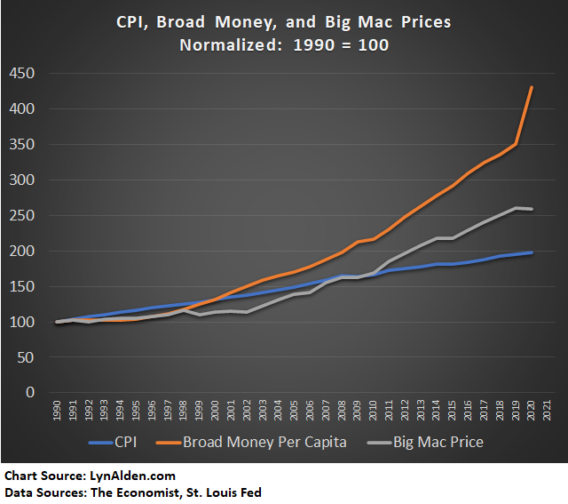
I also looked up McDonald’s gross margins (revenue minus cost of goods) since the 1990s using data from YCharts, and McDonald’s made the same gross margins in 1990 and 2020. So, it’s not like they had the same input costs but simply charged more.
Based on this funny but actually kind of relevant metric, CPI has fallen short over the past three decades, and particularly within the second half of that period. Back in the late 1990s and early 2000s, commodities were very cheap, and so the Big Mac rose in price more slowly than CPI. Starting in 2003, commodity prices had a big rise up, and Big Mac prices caught back up to CPI and eventually outpaced it by a noticeable margin.
During the whole period from 1990 to 2020, the broad consumer price index rose at about 2.5% per year, the Big Mac price rose about 3% per year, and broad money supply per capita rose about 5% per year. I’ll leave it to readers to judge how the quality of the Big Mac has changed or not over the period.
The New Car Test
According to the official CPI for new vehicles in the United States, prices for new cars only rose by 22% for the entire span from 1990 to 2020.
I dug up an old Chicago Tribune article that had some data to cross-reference that. According to that article, the average price of a new car in 1990 was $15,472. In 2020, the average price of a new car crossed over $40,000. That’s more than a 2.5x or 150%+ increase in price, during which the new vehicle CPI says that it effectively rose only 22%.
Why the discrepancy? Well, new cars got bigger and better. They have more features, and preferences shifted towards a higher mix of SUVs, so the CPI model discounted their inflation rate to compensate for that. Offshoring and automation did help suppress vehicle prices on a quality-adjusted basis.
Let’s pick the Toyota Camry as a direct comparison to reduce the size/type changes. The starting MSRP for the automatic was $12,258 in 1990. The starting MSRP in 2020 was $24,425. That’s a 100% price increase, almost exactly. That’s about 2.5% per year.
Certainly we can allow for a substantial amount of quality adjustment in the new car CPI calculation. The new Camry has power everything, a navigation system, better safety features, and better gas mileage. But is the quality/size adjustment enough to reduce the actual price appreciation from 100% down to just 22% on a quality-adjusted basis during this three-decade period, as official new car CPI says was the case?
Plus, according to official CPI reports, the cost of car maintenance has gone up faster than broad CPI during the past thirty years, with a roughly 140% increase from 1990 to 2020. Gasoline prices went up around 130%, which were also faster than broad CPI.
The Broader Test
According to the US Bureau of Labor Statistics, the average American household spends 33% of its expenditures on housing, 17% on transportation, 13% on food, 11% on the combination of insurance and social security and pensions, 8% on healthcare, 5% on entertainment, 3% on charitable contributions, 3% on apparel, 2% on education, 1% on personal care products, and the remainder on other categories.
Housing, transportation, food, healthcare, and education collectively are 60% of the expenditures. The combination of pensions/insurance/social security and charity is 15%. Everything else combined is 25%.
The median house, healthcare CPI, and education/childcare CPI all went up faster than broad CPI according to the official metric. Food CPI was in-line with broad CPI according to the official metric, but potentially higher according to things like the Big Mac Index.
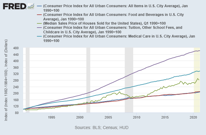
Chart Source: St. Louis Fed
New car prices, as we saw, went up at the same rate as CPI (about a 100% increase from 1990-2020, or 2.5% per year) even though their CPI model said they went up extremely slowly on a quality-adjusted basis. Car maintenance CPI and gasoline prices officially went up faster than CPI as well. Overall, transportation spending grew at least as fast as broad CPI.
So, if the majority of things that Americans spend money on went up faster than broad CPI, it brings into question the accuracy of broad CPI. That basket of housing, education, food, healthcare, and transportation represents 60% of total average household spending according to the BLS, or about 70% of total ex-pension and ex-charity spending.
If 70% of their goods/services expenditure basket is going up equal-or-higher (in some cases notably higher) than the broad inflation rate, do cheaper goods in the smaller category outweigh that?
That discrepancy is how we get to a situation of NY Fed Chair Dudley talking about the iPad 2 vs the iPad 1, and an audience member shouting back that you can’t eat an iPad.
Here’s a chart that shows various prices, including the median house, healthcare CPI, tuition/childcare CPI, the Big Mac, and major commodities, relative to broad money supply per capita and broad CPI:
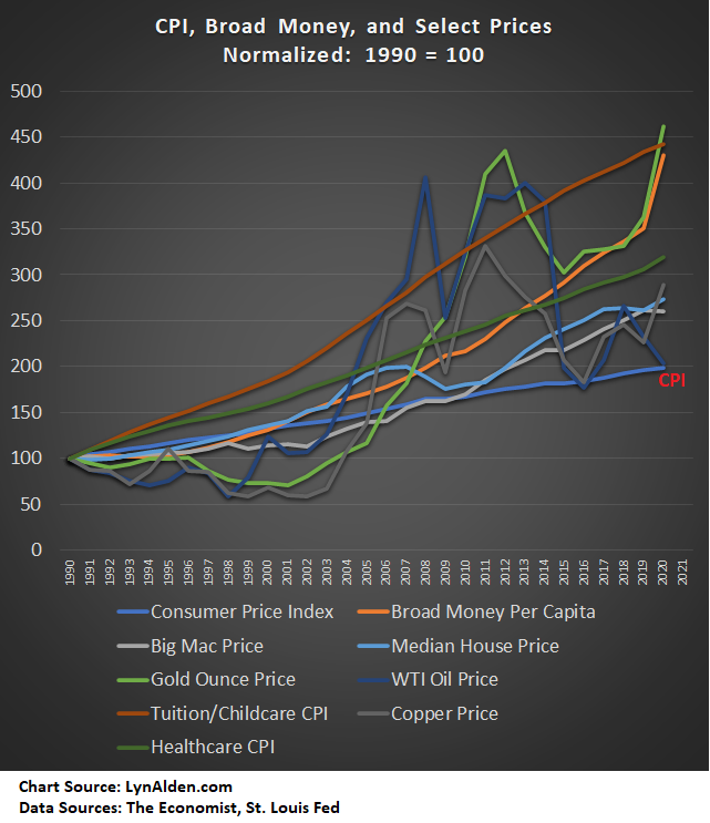
During the three-decade length of the chart, most major expenses and commodities rose faster than CPI.
There are many deflationary or low-inflation categories as well. Unlike the chart above, electronics, apparel, digital goods, toys, and many other consumer products have indeed either deflated in price or inflated less slowly than CPI, thanks to improving technology and offshoring labor to cheaper markets. Collectively, however, these types of items and services only represent 25% of household spending according to the BLS, or 30% of ex-pension and ex-charity spending.
House Prices vs Owner-Occupied Rent
One of the discrepancies in various measures of consumer price inflation is the way housing costs are calculated. The biggest expense for most people is their house or apartment, so differences here play a huge role in how accurate an inflation basket is.
The median house price has outpaced broad CPI over the past three decades. The CPI went up about 2x (100%) over that period while the median house price went up around 2.8x (180%). The median home size grew about 15% during that time, but even doing an adjustment for that, the median house price per square foot has risen faster than CPI.
The CPI, however, does not include house prices, since that is a capital asset rather than a consumption asset. Instead, they use “owner’s equivalent rent”, where they do surveys to ask people what they think the price to rent the dwelling they have would be. In some ways this makes sense but in other ways it opens up survey errors and introduces financing costs.
The big discrepancy in this part of the calculation is whether or not we should include financing into the price of a home when calculating the cost of the home. Since owner’s equivalent rent looks at monthly cost, it indirectly takes into account financing rates.
Using the Bankrate mortgage calculator and historical mortgage rates from the St. Louis Fed, assuming 20% down with a 30-year fixed mortgage, here is a back-of-the-envelope check. If you bought a median home in 1990, it would cost around $125,000 and you’d have a 10% mortgage rate. Your estimated monthly payment would be $1,025. If you bought a median home in 2020, it would cost nearly $350,000 and you’d have a 3% mortgage rate. Your estimated monthly payment would be $1,476.
In other words, despite the fact that the price of the median house went up faster than the CPI rate, the monthly cost of owning the median house with leverage went up less than 1.5x (50%) during this three-decade period, which is less than the broad CPI rate.
However, if the item itself goes up in price by a lot, but the cost to finance it goes down, does that mean price inflation didn’t happen? The actual collection of lumber and labor and land that went into that house on an apples-to-apples basis even accounting for size differences is more expensive if you were to buy it unlevered. The bank simply gets a smaller cut of the ongoing cost, if it’s bought on leverage.
That aspect alone can make a big difference in CPI calculations, since it makes up about a third of the basket. Yes, the cost of owning the median home through long-term financing hasn’t risen much, even though the actual price of the median home has outpaced the CPI growth rate.
For similar reasons, rent hasn’t quite kept up with CPI over the past few decades in most locations. The landlord has lower financing costs, which keeps their costs lower even if the property itself is more expensive, and so that trickles down into keeping rents from rising too quickly.
So, this is another discrepancy; the price of purchasing unlevered property vs the cost of buying or renting that property with leverage using lower financing costs, affects CPI calculations.
Education Necessity
One of the biggest price growth outliers was tuition, with a 4x (300%) increase compared to 2x (100%) for the broad CPI from 1990 to 2020.
Decades ago, a 4-year or 6-year college education wasn’t necessary to have strong wages. Right out of high school, young adults could start earning money without student debt assigned to them. More prestigious careers of course generally needed the higher degrees.
But due to globalization, offshoring, automation, and reduced union participation, there has been considerable downward wage pressure on many types of non-college jobs. The median male income has been virtually flat in inflation-adjusted terms over the past four decades, but he increasingly needs a college degree and student debt in order to earn that median income. And the cost of that degree has gone up at twice the pace of broad CPI.
The proliferation in student debt, becoming a meaningful problem, is a very recent phenomenon:
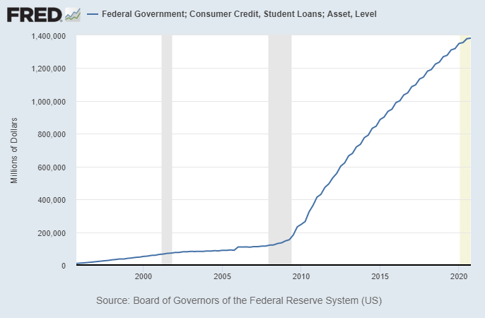
Chart Source: St. Louis Fed
This contributes to a lot of people feeling like they’re running in place, because they are. Wages are only going up in line with price inflation, and yet a bigger up-front investment (and/or ongoing student debt payments) is needed to get that income.
Republican political strategist Oren Cass popularized the notion that major expenses are rising faster than wages a couple years back:
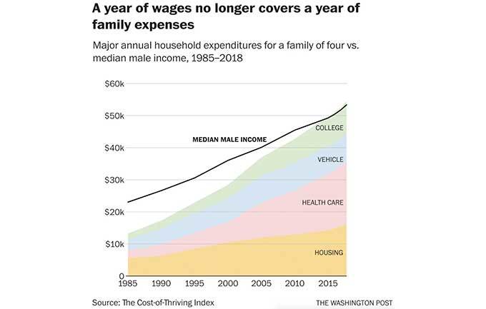
Chart Source: Washington Post, Oren Cass
The idea was critiqued around the margins. For example, the healthcare calculation assumes that the worker is self-employed and paying the full cost, whereas most folks earning the median wage are employed and have part of that expense covered.
The left-leaning Economic Policy Institute has a widely-shared chart of productivity and compensation that shows a similar outcome, to which I added an annotation in red:
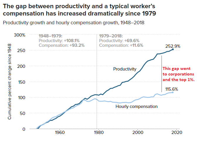
Chart Source: EPI
Outsourcing and automation were fantastic for investors and not great for blue collar workers. The first group got all the benefits without the drawbacks, while the second group got some of the benefits but the full cost of the drawbacks.
When you add everything together, the middle and working classes have indeed been squeezed. The share of US net worth held by the bottom 90% of the country decreased from about 40% to 30% from 1990 to 2020:
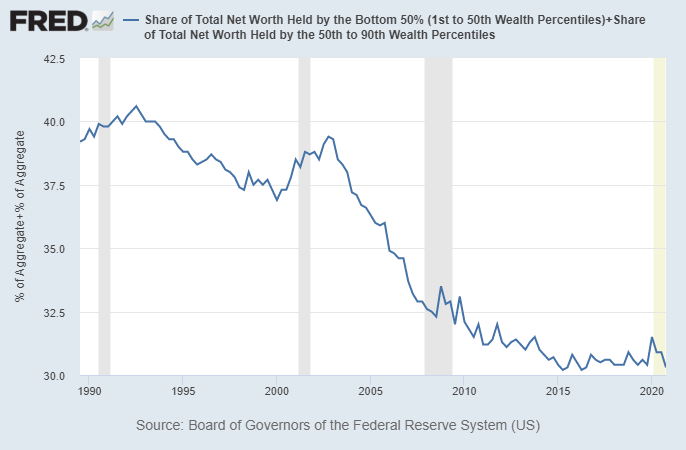
Chart Source: St. Louis Fed
The top 10% have increased their share from 60% of the wealth to 70% of the wealth. The top 1% alone hold slightly more household wealth than the bottom 90% combined.
So naturally, most people don’t feel like price inflation is as low as CPI says it was. Their actual ability to buy a good living doesn’t match with what it says.
CPI Accuracy Summary
If we approximate the cost of living the classic “American Dream” solid middle class life of a spouse, 2+ kids, a single family home, healthcare, university, a car, an annual vacation, and quality meals, I find it hard to match that to the reported CPI over the past three decades. The big expenditures that make up 60-70% of the typical household annual expenditures went up faster than CPI, and could not have been offset by disinflation in the remaining smaller categories.
On the other hand, if someone lives in their parents’ home or rents a suburban apartment, skipped university, doesn’t have kids, and most of their expenditures are on electronics, digital goods, food, their car, and apparel, then their cost of living probably is accurately reported or quite possibly even overstated by the CPI.
Overall, this 1990-present period has been a recipe for inflation controversy. Labor offshoring and information technology have suppressed both wages and prices in many categories, while the biggest costs of living that can’t be outsourced or digitized have outpaced CPI. Lower financing costs have kept the monthly cost of some of those big-ticket items like the median house in check even though their actual prices inflated at an above-CPI rate. On the other hand, a bigger upfront investment in student debt is often required compared to previous history in order to earn a decent income. As a result of all of this, broad money supply went up a lost faster than CPI and was collected by folks in the top income brackets, and there is plenty of controversy about the accuracy of CPI.
Based on the data, it seems that with an apples-to-apples comparison, the American Dream basket of goods and services has risen faster than CPI, especially if unleveraged. You need to downsize living standards and take into account lower costs of financing, to get a result that says otherwise.
Think of it like this. CPI says that price inflation averaged about 2.5% per year for the past three decades. Factoring out some questionable parts of the model, a number of around 3% seems more realistic. However, because more education/debt is required to get the median income, inflation at the end of the day feels more like 4% annualized for many people, and the bottom 90% of the income spectrum are collectively losing pace vs the top 10%. Broad money supply per capita rose at 5% per year during this time, but a lot of it concentrated in the upper echelons of society; those who benefited from the technology/offshoring the most.
